Web Experience Design, Shankara Cancer Hospitals
UX Design & Development of multiple web portal experiences for a Hospital group, with backend service integrations and CMS, with information architecture, interaction patterns, data-driven workflows and cohesive visual experience.
- Web Development
- UX Design
- Brand Design & Strategy

Spindigo Designs enhanced the web presence of Sri Shankara Cancer Hospitals by conducting extensive research, redesigning for intuitive navigation, adopting a modern CMS, and creating a unified visual design to improve user engagement and reflect the hospital's commitment to excellence.
- Requirement Gathering
- Website Audit
- Competitor Analysis
- Surveys & Feedback
- Information Architecture
- User Flows/Journey
- Stakeholder Interviews
- A/B Testing
Research & Understanding
We dedicated several months to gathering and analyzing information from the hospital’s 12+ years of operations. This involved speaking with doctors, stakeholders, and staff to uncover the wealth of knowledge accumulated over the years. Our research allowed us to structure the information effectively, prioritize it by severity and importance, and suggest ways for the hospital’s content team to organize it. This process of research enabled us to build User Personas, User Journeys and eventually come up with appropriate and effective Wireframes for the portals.
This thorough analysis laid the foundation for designing a user-friendly web portal that visitors could easily navigate and interact with.
Colors & Typography
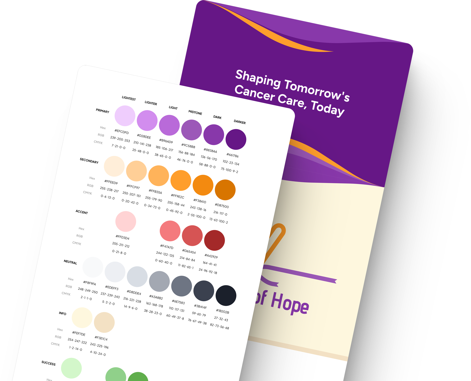
The design team crafted a vibrant, confident color palette to bring a sense of positivity to the sensitive subject of cancer, and paired it with clean, modern, highly readable typography—ideal for presenting long-form content like procedures, guidelines, and doctor profiles in an engaging, accessible way.
UI Design
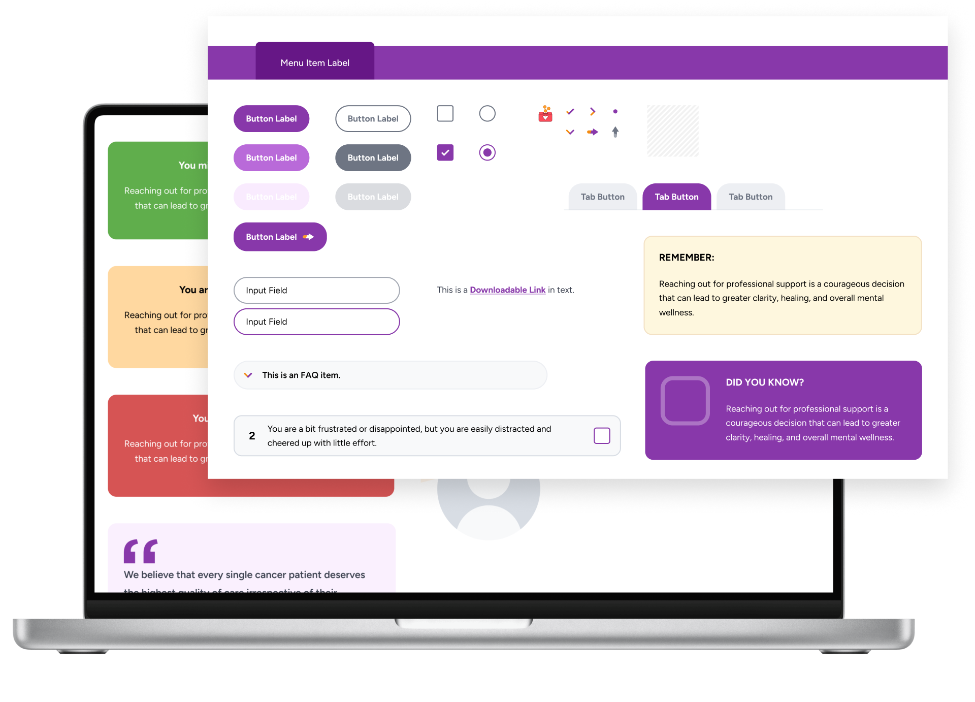
Combining multiple websites with a vast range of interactions, we designed a comprehensive and robust yet multi-device user interface components. The set of components range from buttons, form components, to panels, cards, accordions, sections, menus, tabs, tables, and many more. These were inline with the project's colors and typography, legible and most of all, accessible.
Illustrations & Iconography
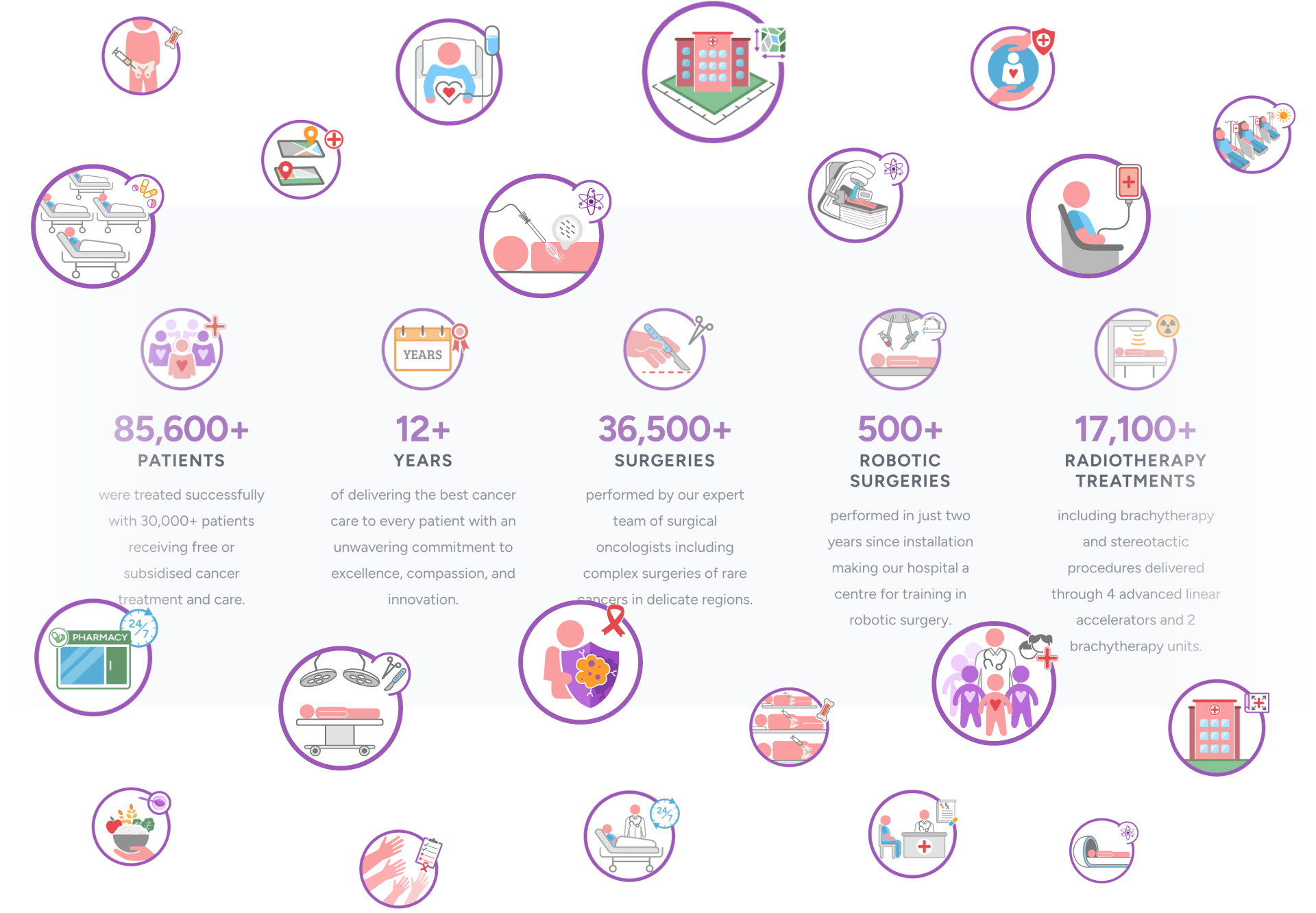
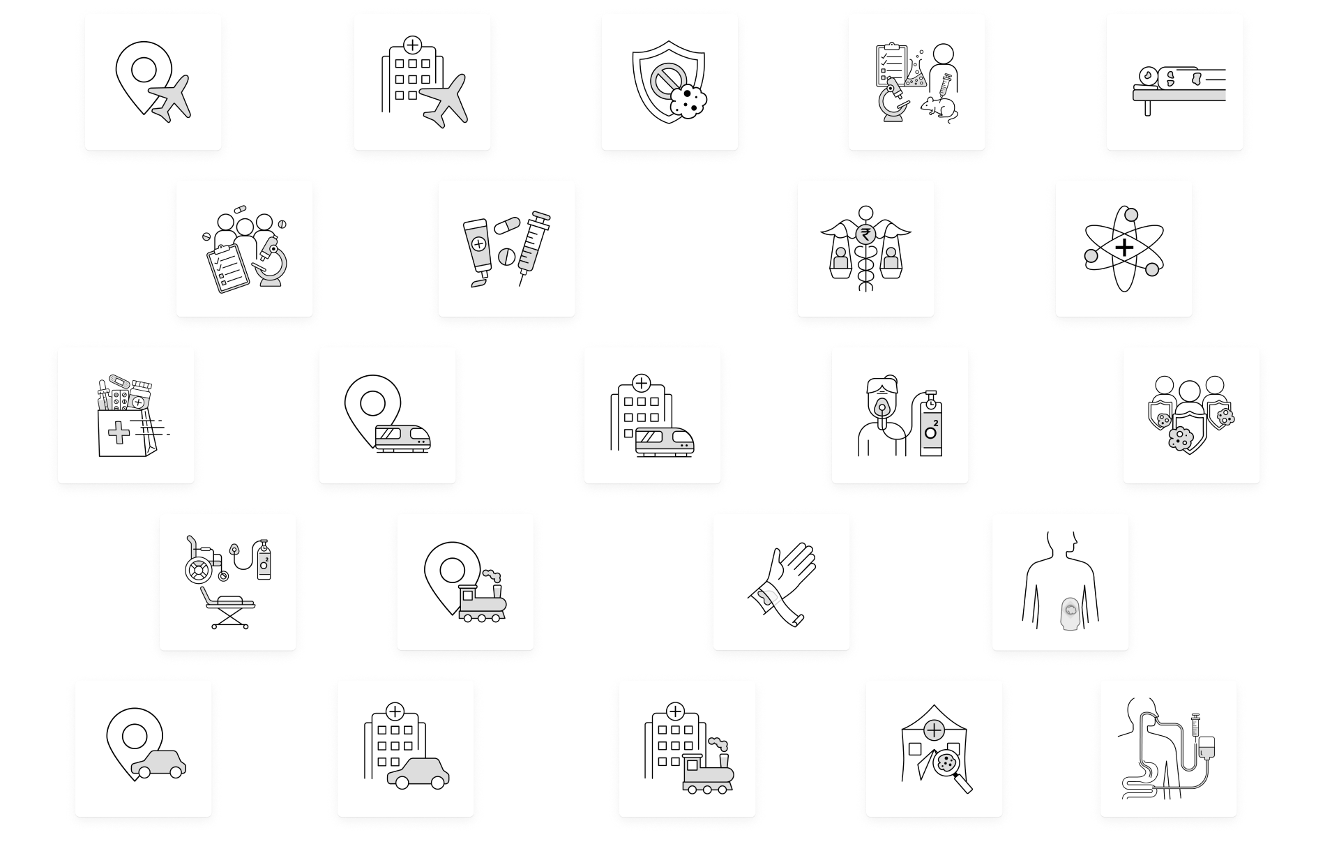
We created custom illustrations and icons to enhance the visual experience across the web portal. These elements were consistent in style and color, adding a bright, positive touch to the site while maintaining the seriousness of the content. The iconography were designed with different types of necessities across the websites.
1. Site/Feature Icons
These icons represented features or USP of the brand/business. The icons here were designed to go in-line with the brand colors and uphold the meaning of the colors through minimalistic illustrations that represented the concepts of features being illustrated.
2. Card/Information Icons
These icons mostly served as secondary visuals for important bullet points, parameters or take-aways of various sections across the website. These were illustrated to ensure the bullet points were visually grasped faster by the visitor.
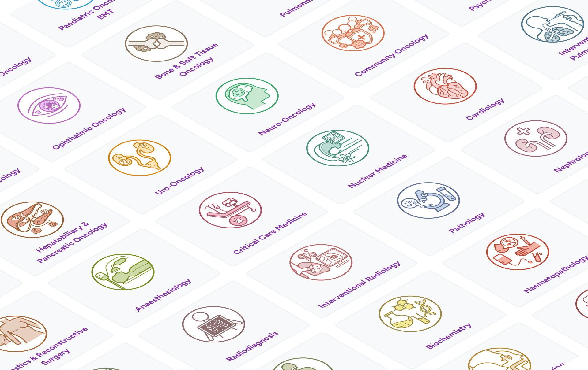
3. Department Icons
40+ departments were illustrated through minimalistic icons. These icons went through extensive understanding of what each department specialises in, and represent them visually so the meaning of the departments are even more easily understandable by the visitors/patients. As preferred by the stakeholders, we also introduced a variety of colors for each department, eventually enforcing those department pages to be influenced by the colors of their respective icons.
4. Page Icons/Illustrations
Most pages of the websites mostly talked about various topics belonging to a broader subject/categorisation of information. We introduced simplified illustrations that were fresh, colorful and conceptually meaningful, to represent each page. This enabled visitors who were often from non-medical background, to understand the gist of the page/concept easily.

Responsive UX Design
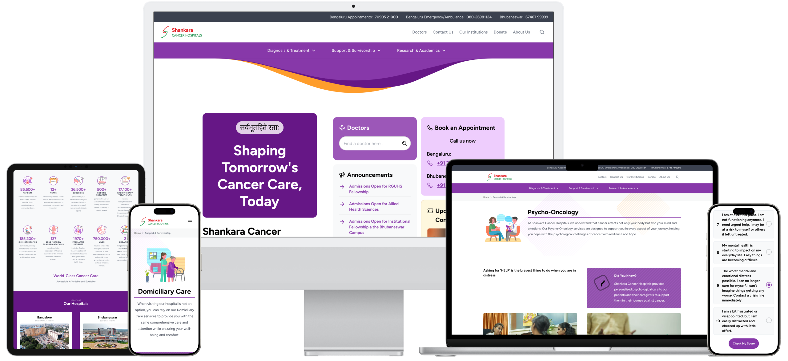
The websites were built to be fully responsive, adapting seamlessly to different screen sizes, including desktops, laptops, tablets, and smartphones in both landscape and portrait modes. Rigorous testing ensured that every feature and page functioned perfectly across various browsers, devices, and resolutions. Irrespective of where the patients visited the hospital website from, it was designed to look and behave appropriately.
The Final Output
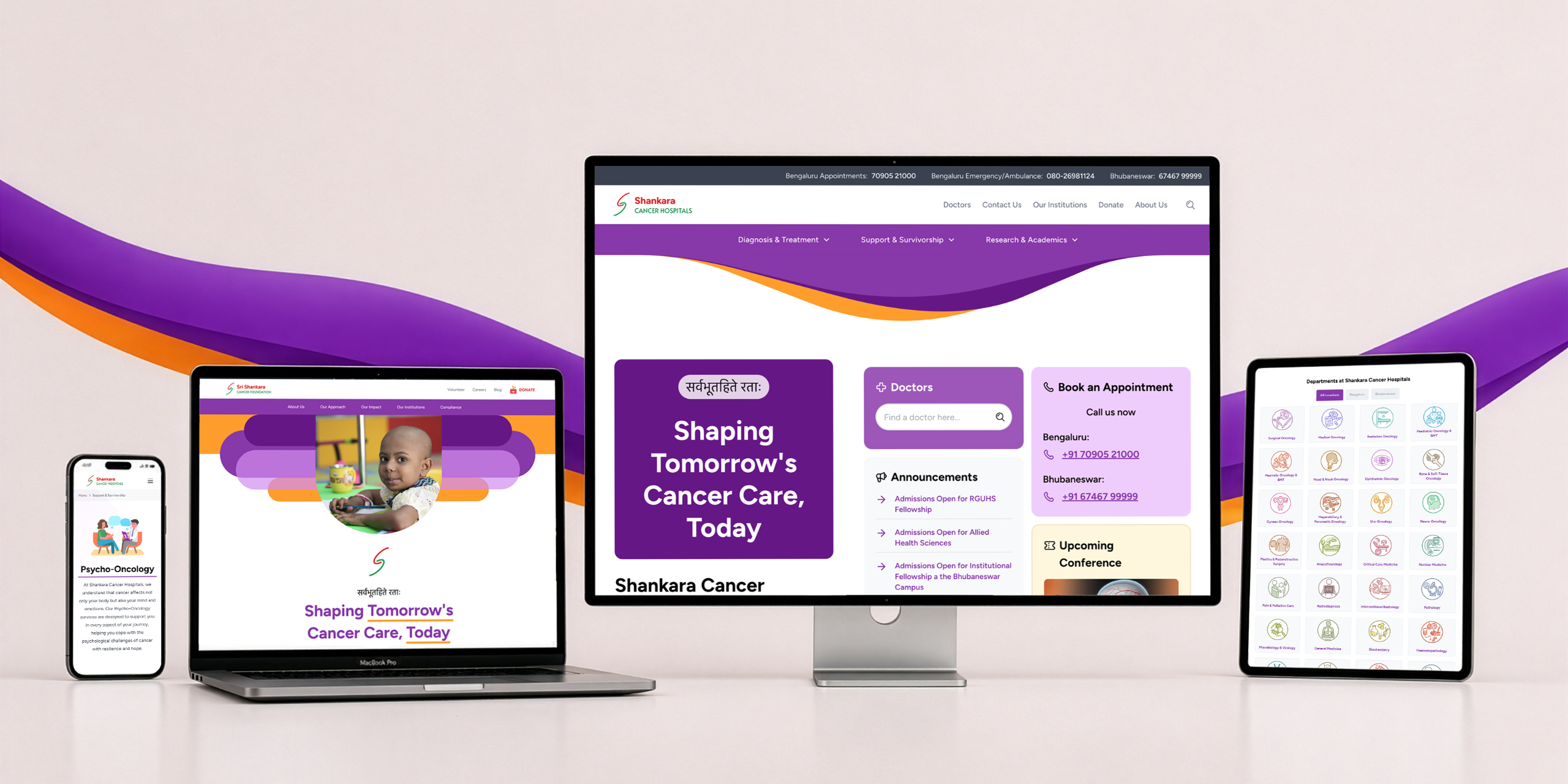
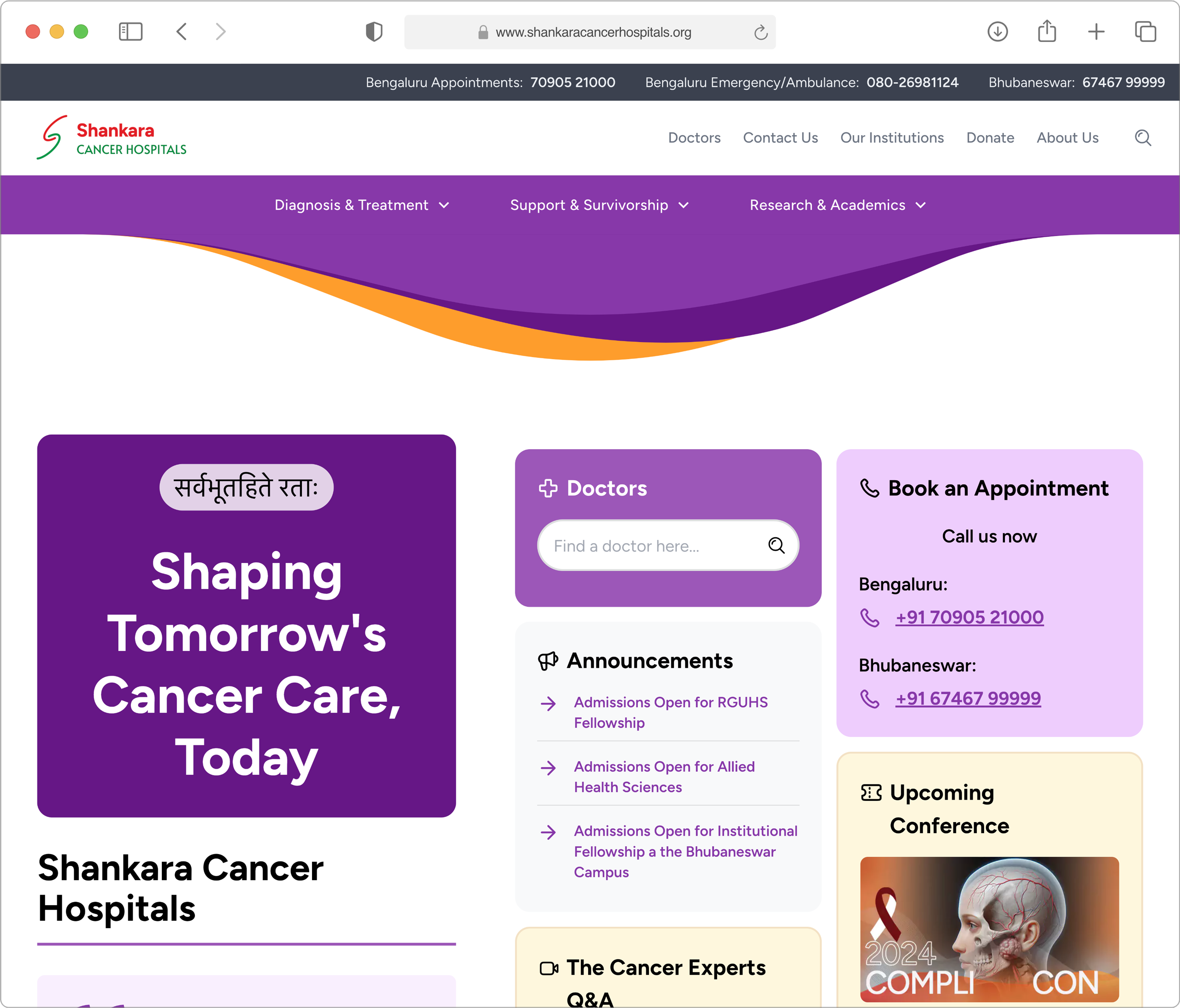
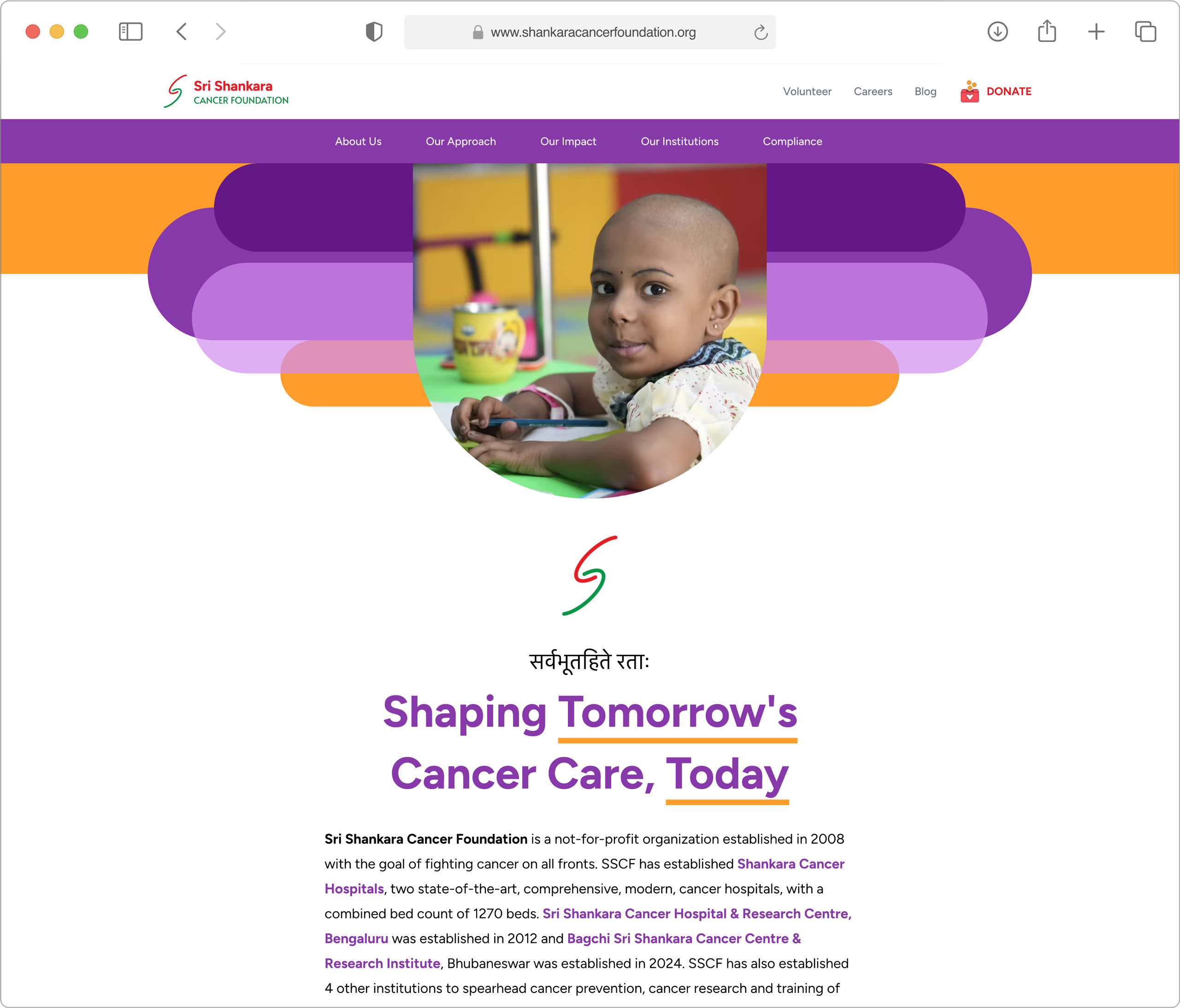
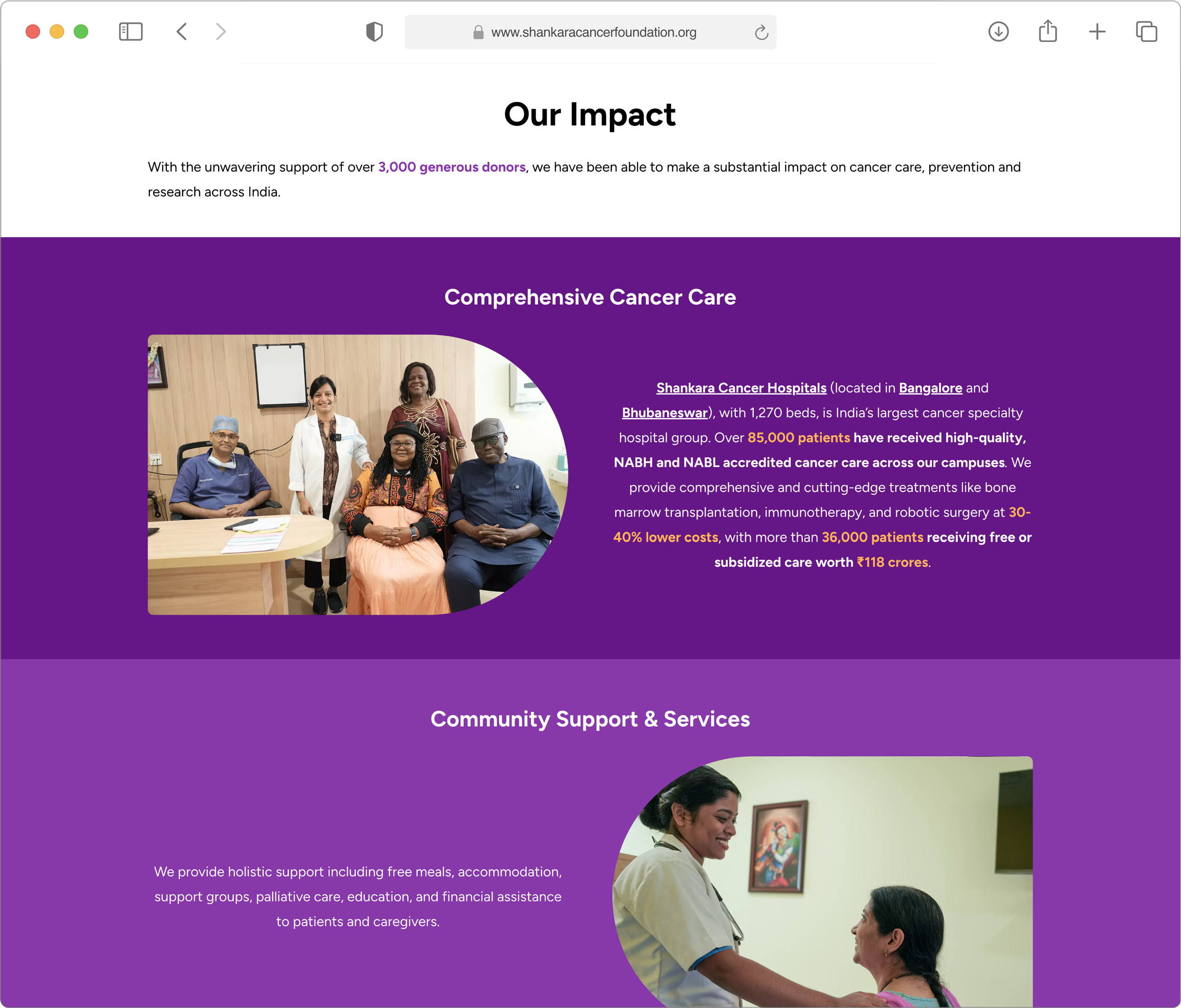
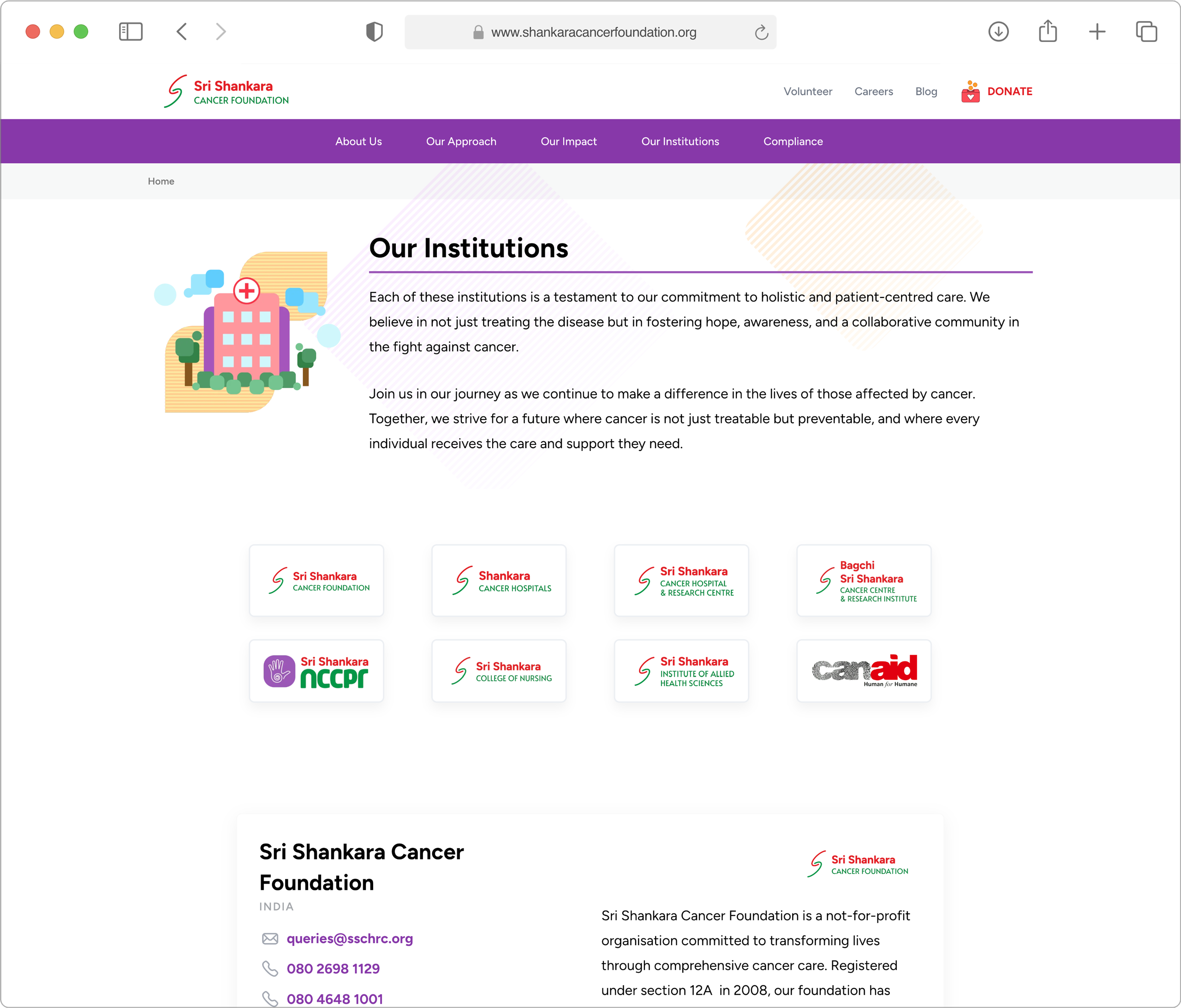
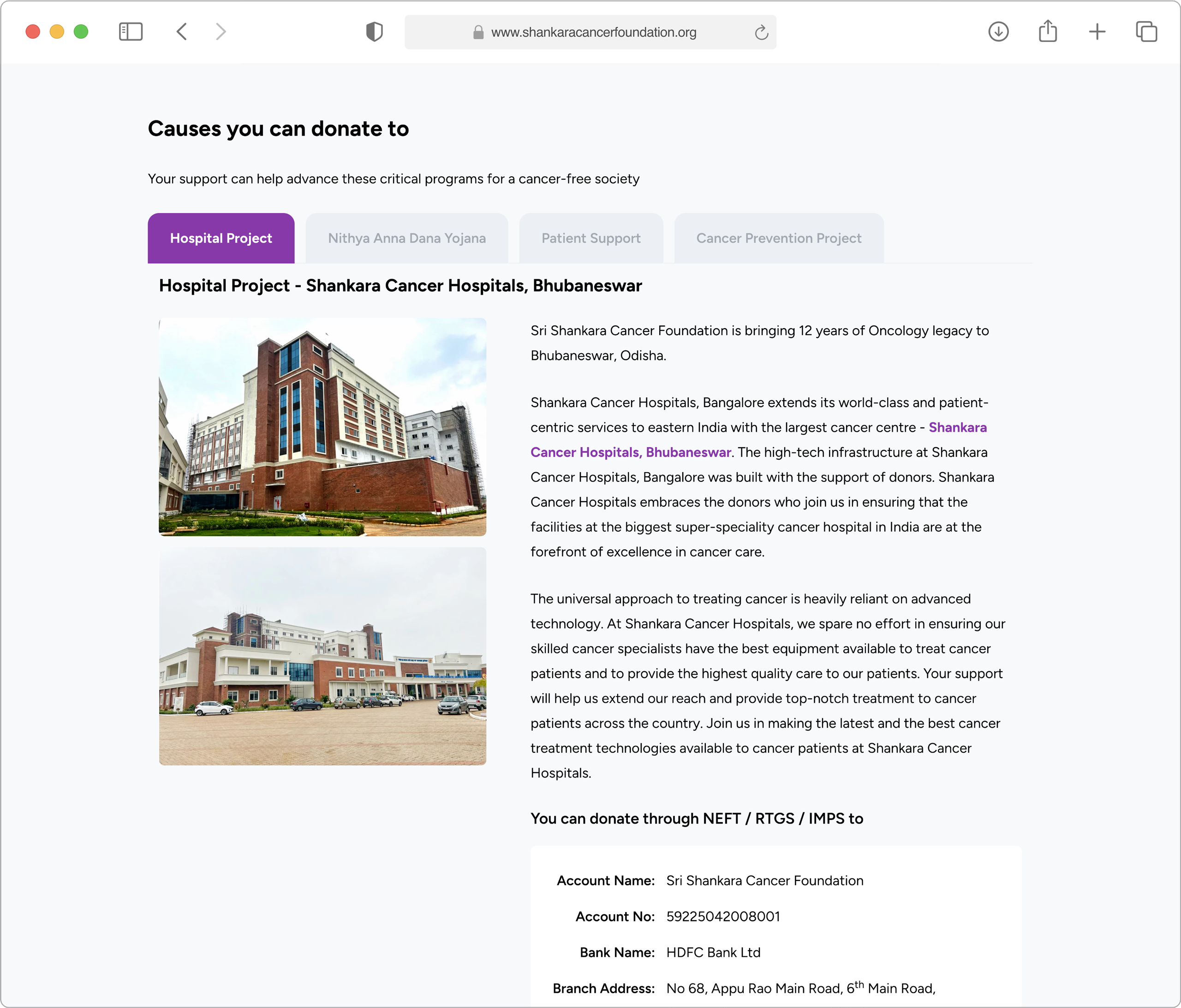
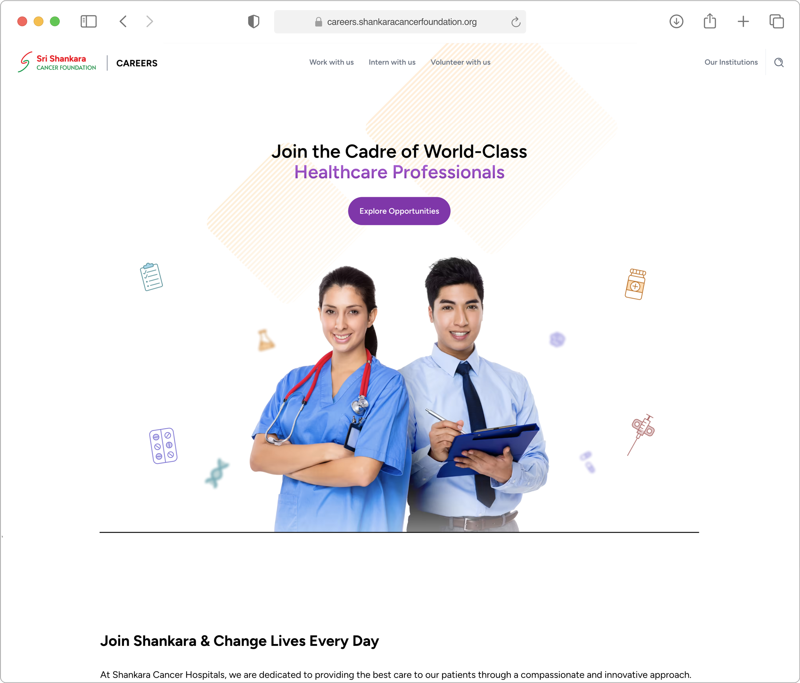
As part of an on-going work engagement with Sri Shankara Cancer Foundation, we have currently ideated, conceptualised, designed and developed 3 websites. Here are a few screenshots: -
Hospital's Website
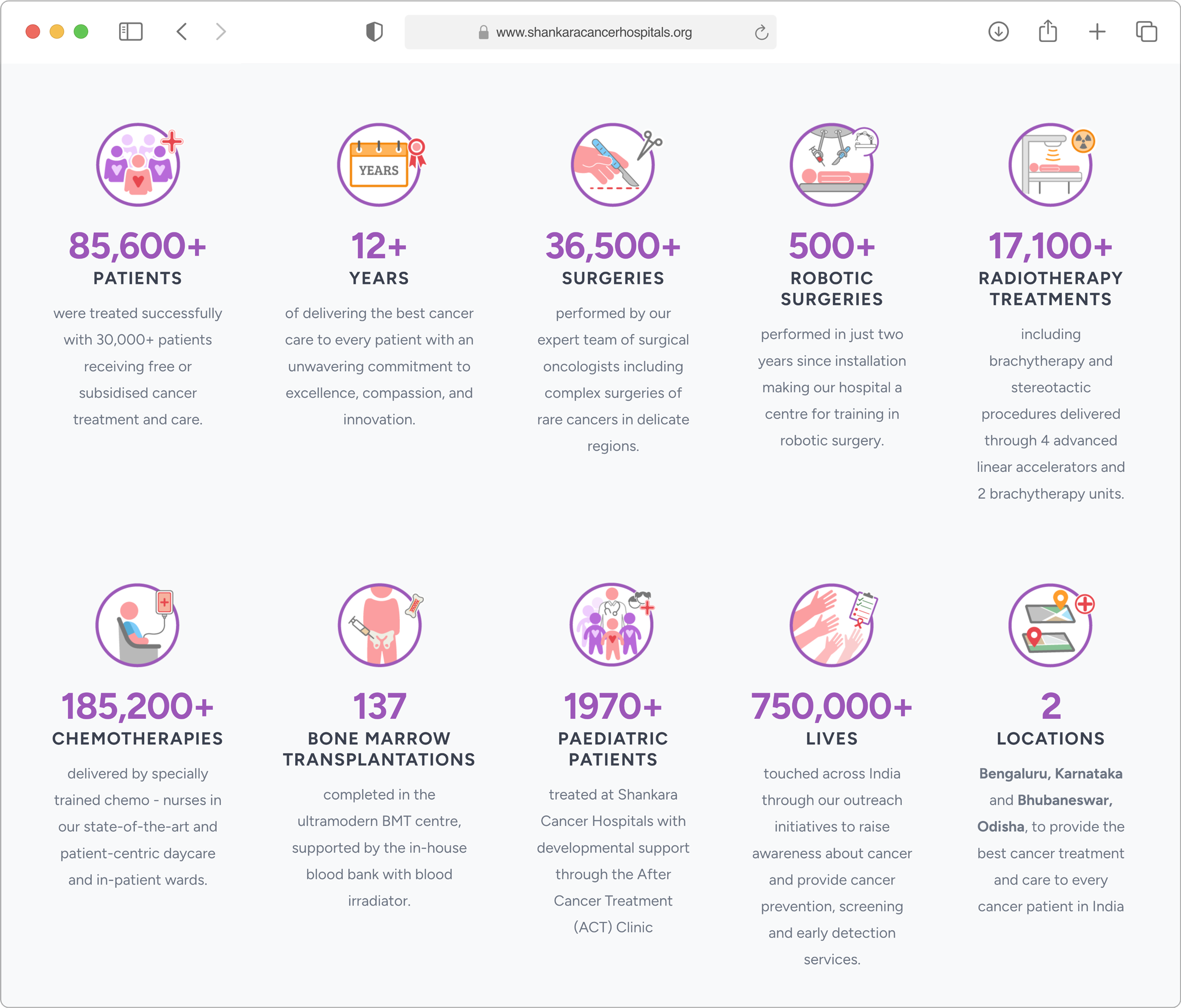
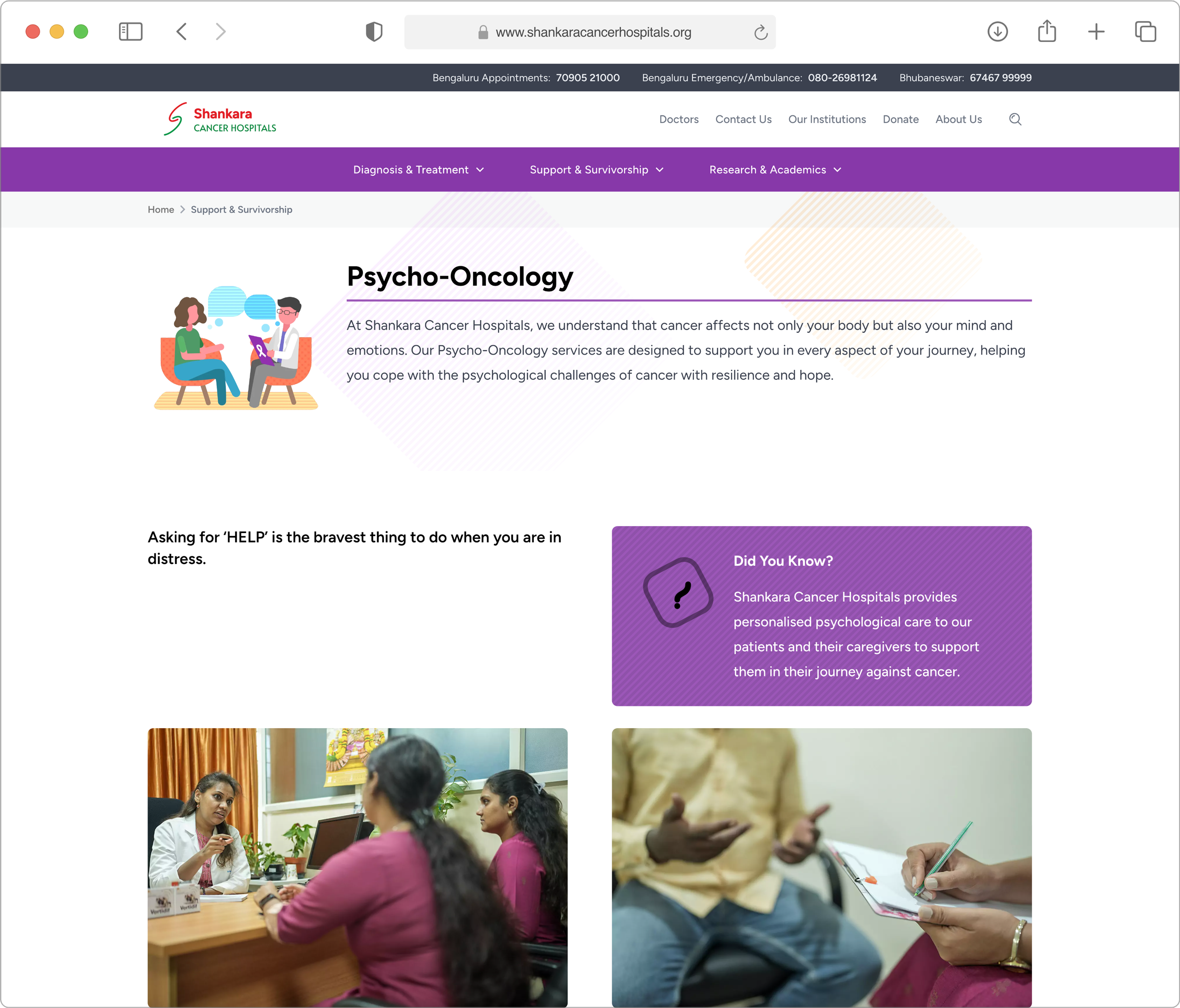
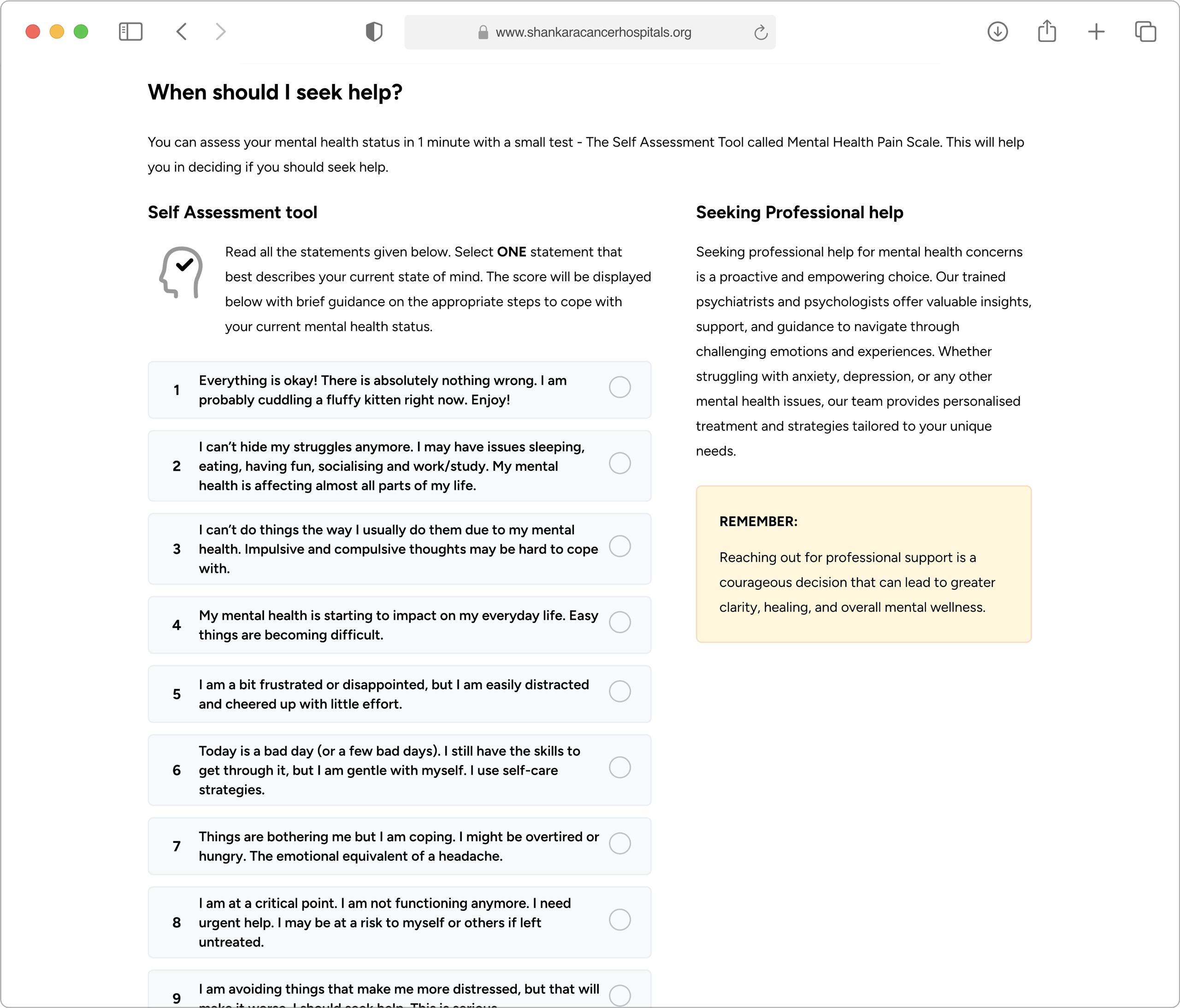
Foundation's Website
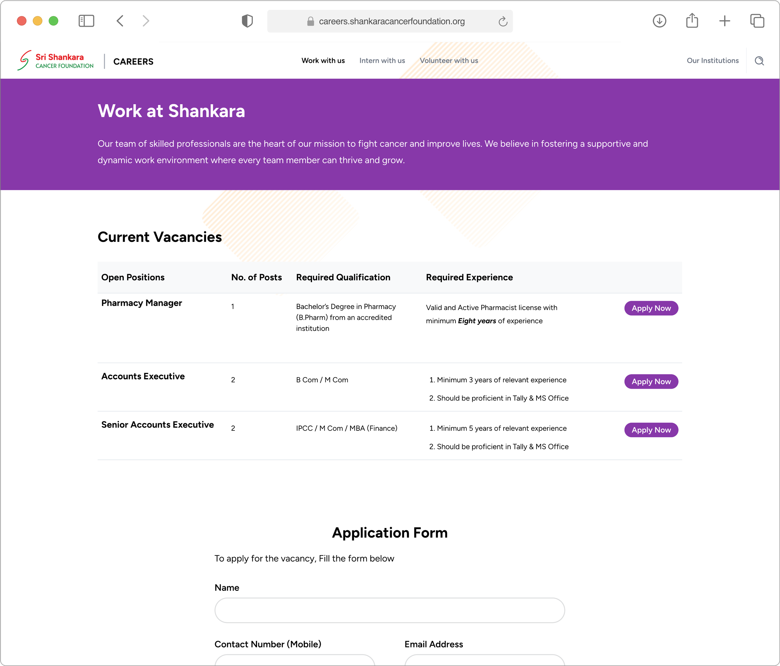
Careers Portal
Mobile Quick Launch Menu
For mobile visitors seeking to reach the emergency numbers quickly, we built a custom quick-launch menu. This provided easy access to hospital emergency/ambulance and appointment numbers, while also enabling to reach the hospital team through quicker channels.
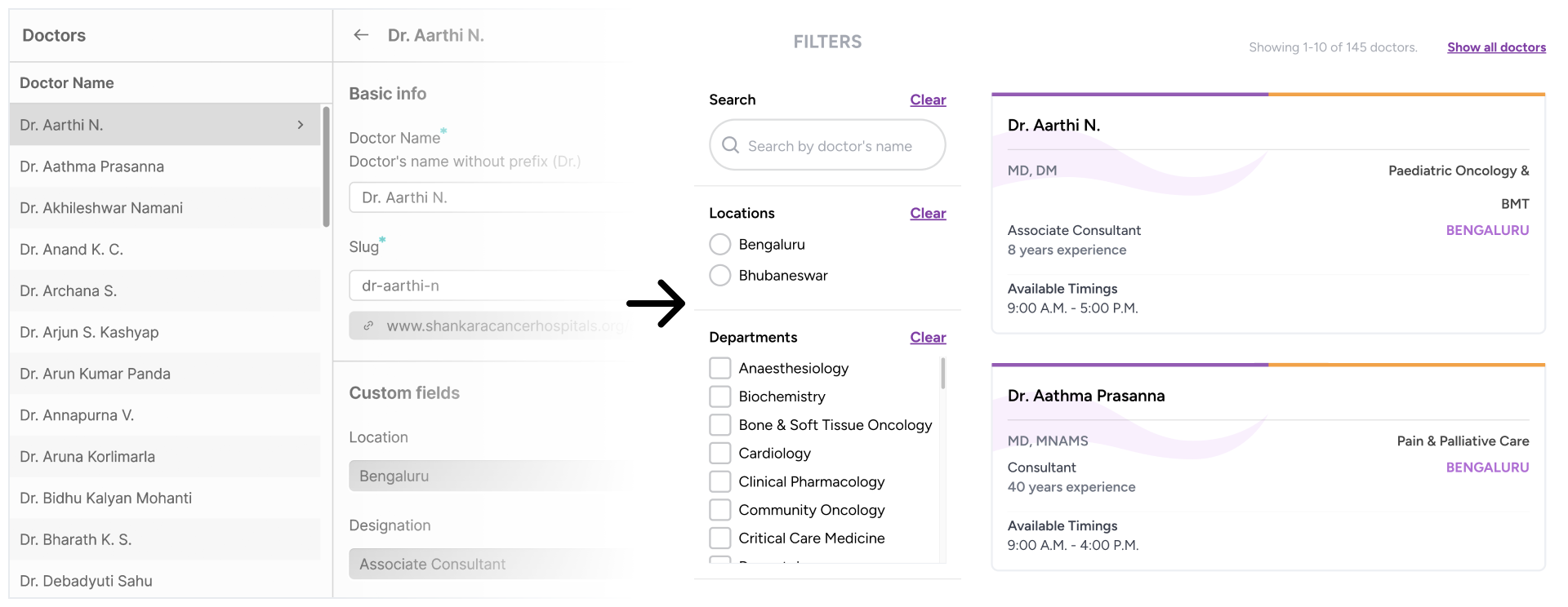
Dynamic Content with Filters
Key sections such as Doctors, Departments, Facilities, and Blogs were powered by a dynamic CMS, allowing for easy search and filtering of content. This made it simple for users to find the information they needed quickly and efficiently.
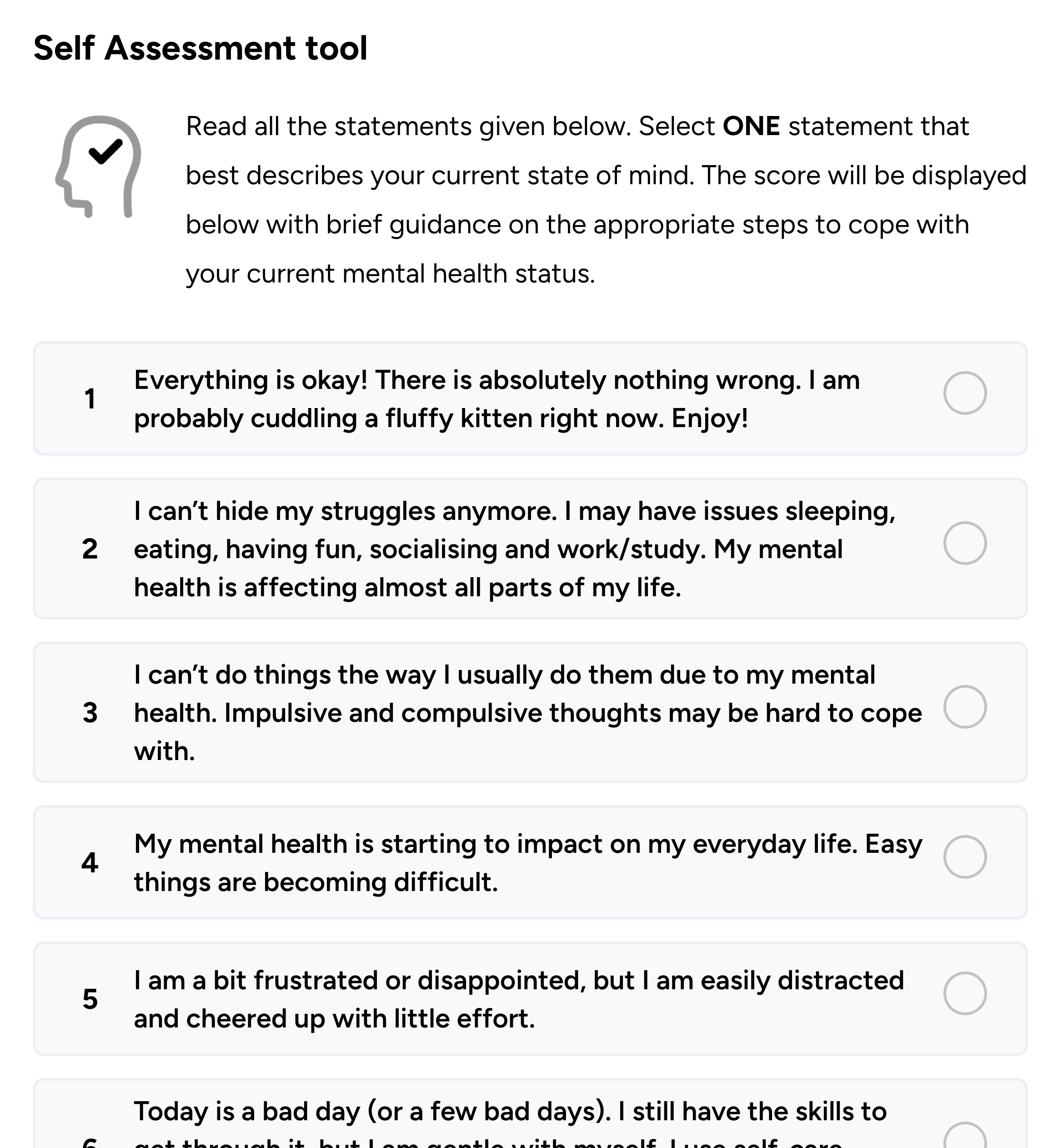
Interactive Forms
We added interactive features, including custom assessments that helped visitors determine whether they needed to see a doctor or could benefit from certain activities. These interactive elements enhanced the overall user experience by providing personalized, actionable advice.
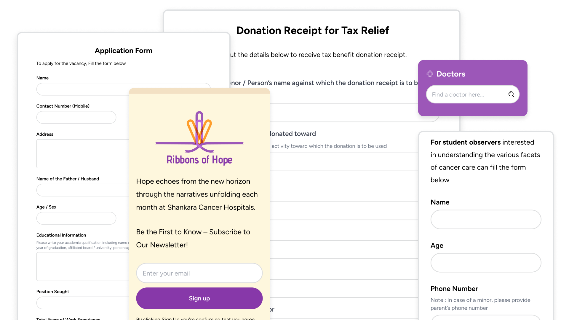
Dynamic Forms
Forms were integrated with the backend, dynamically connecting with CMS data to provide a more interconnected experience for users. This allowed for more efficient form submissions and responses, improving the overall usability of the sites. The forms varied from search, newsletter subscription, applications, tax receipt request forms, etc.
Outcome
- Increased SEO Ranking Laying the foundation for improved discoverability on search engines.
- Faster Load Pages now load faster, even on low bandwidth connections.
- Reduced Bounce Rate Retain visitors longer by guiding them intuitively to relevant information, reducing premature exits.