An Elegant Identity Inspired by Music and Form for Exodus Music School
A music school identity built around a simple idea where the brand name itself becomes the foundation for a distinctive, music-inspired logomark.
- Logo Design

The goal was to create an identity that felt elegant and clearly rooted in music. The client wanted the logo to reflect creativity as well as professionalism.
Initial Ideas For The Logo
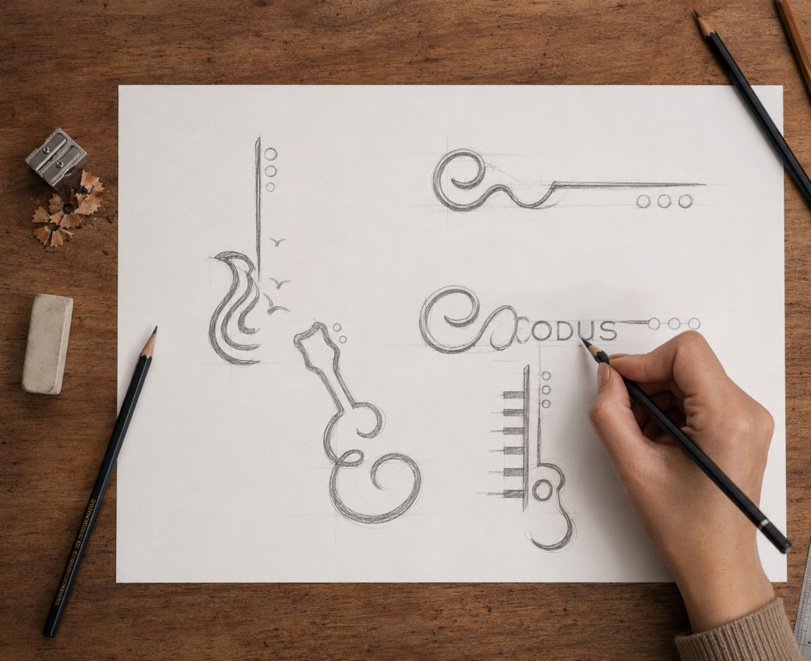
The initial exploration focused on creating a music-related symbol that felt original and integrated with the name, rather than adding a conventional guitar or musical note beside the typography.
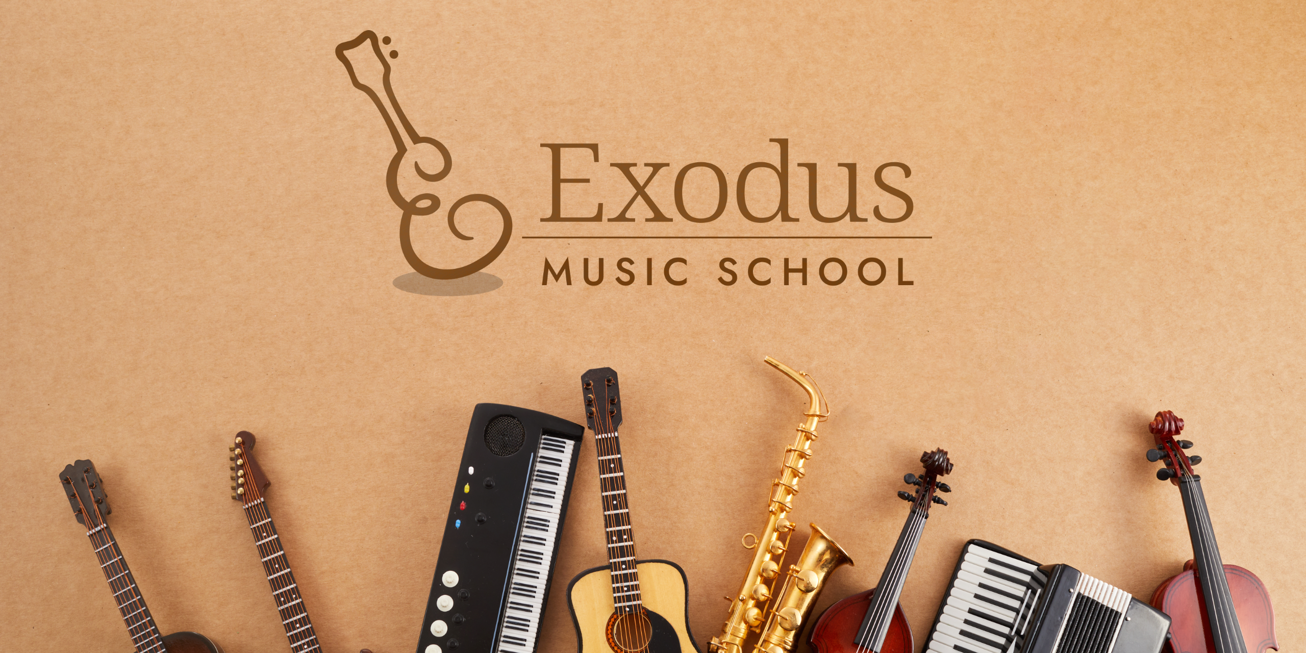
The final direction emerged from using the letter “E” itself as the starting point, allowing its curves to naturally evolve into the silhouette of a guitar.

The Final Output
The core idea was to create a mark where typography and music become one. The letter “E” from Exodus is reimagined as the form of a guitar, with its flowing curves creating the instrument’s body while the extended stroke forms the neck. The result is a symbol that reads both as a letterform and as a musical instrument.
The cursive, fluid treatment gives the mark a sense of rhythm, movement and expression, while its simplicity keeps it elegant and recognisable.
The accompanying serif typography for Exodus adds sophistication and maturity, while the clean uppercase treatment of Music School provides structure and contrast.
The colour palette combines teal with warm earthy brown, balancing freshness and creativity with warmth and stability.
Summary
Overall, the Exodus Music School identity is elegant, expressive and musically relevant, built around a simple typographic idea with strong visual recall.