A Hospital Brand Reborn - Dr. Rama Sofat Hospital
Evolving a dated, low-resolution mark into a warm, cohesive identity ready for modern digital, print, and social media use.
- Logo Design
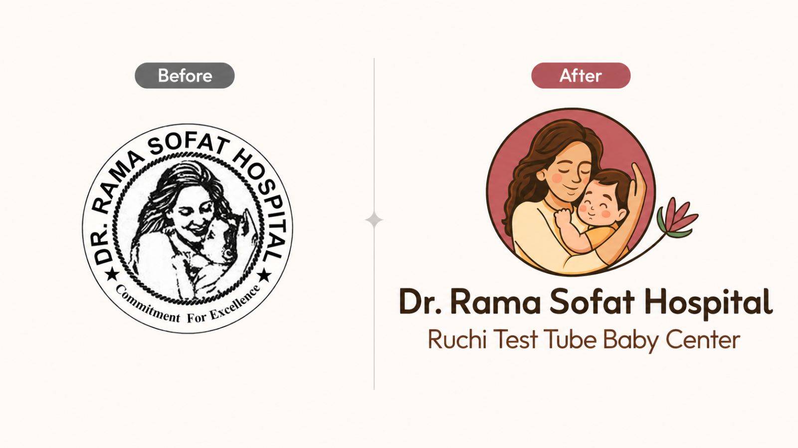
Previously, Dr. Rama Sofat Hospital had a deeply emotional logo centred on a mother embracing her child. But the identity itself was dated, color-undefined, and existed only as a low-resolution file with no supporting brand system.
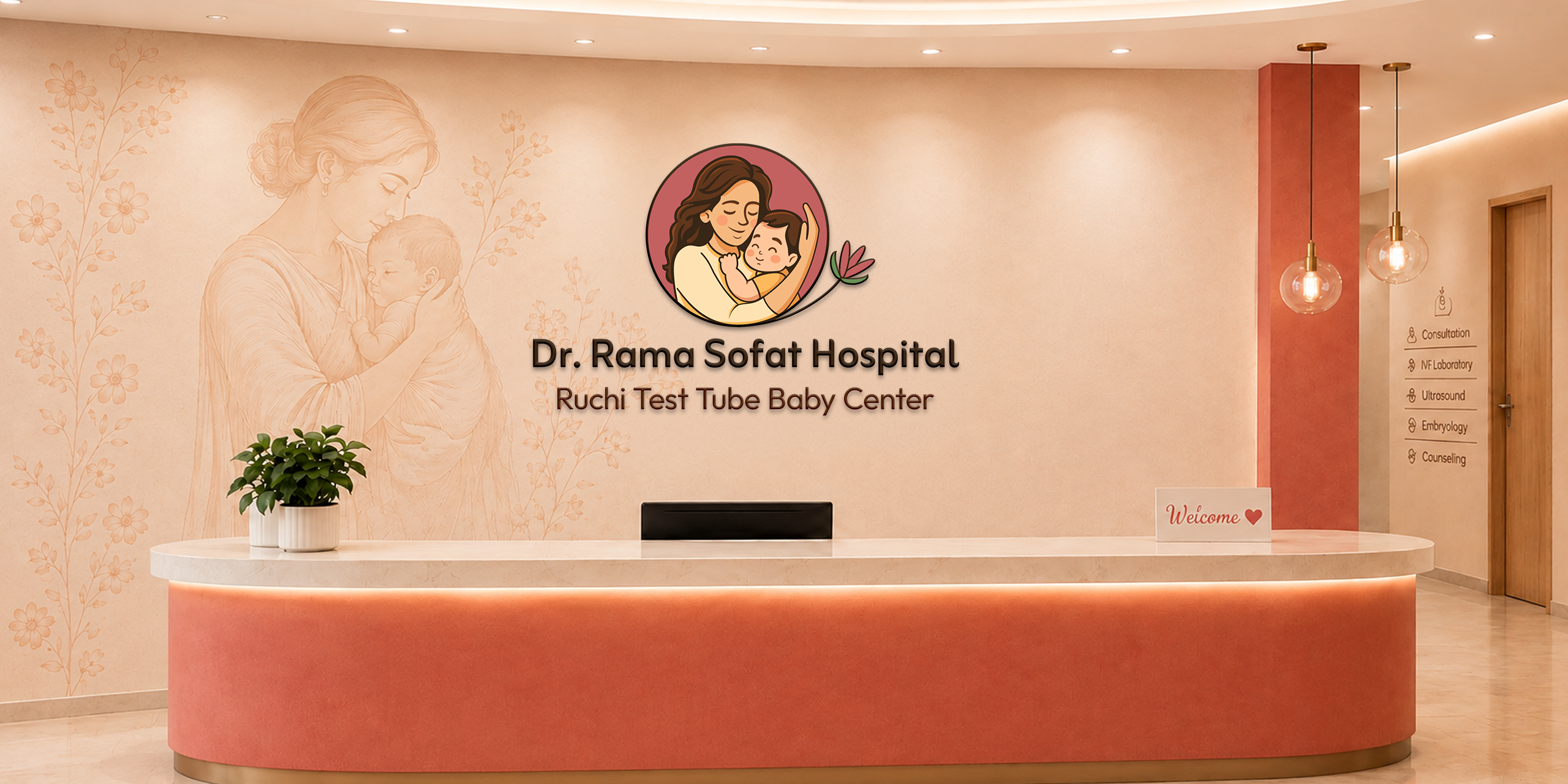
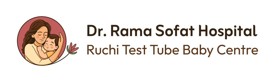
Spindigo Designs LLP redesigned the brand while preserving that emotional core, creating a refined logo, colour palette and cohesive visual system. The new identity is built to work across print, social media and digitally.
The result reflects the hospital’s essence - tenderness, care and the joy of new beginnings.
Preserving the Emotional Core
The redesign of the logo preserves the brand’s emotional core - a mother’s loving embrace of her child , reinterpreted in a softer, warmer and more contemporary style. A delicate colour palette reinforces this feeling, evoking tenderness, reassurance and care for patients navigating fertility and motherhood.
A subtle floral motif added to represent hope, growth, and new beginnings, reinforcing the hospital's work while bringing visual grace and a sense of quiet optimism to the mark.
A Brand System Ready to Scale
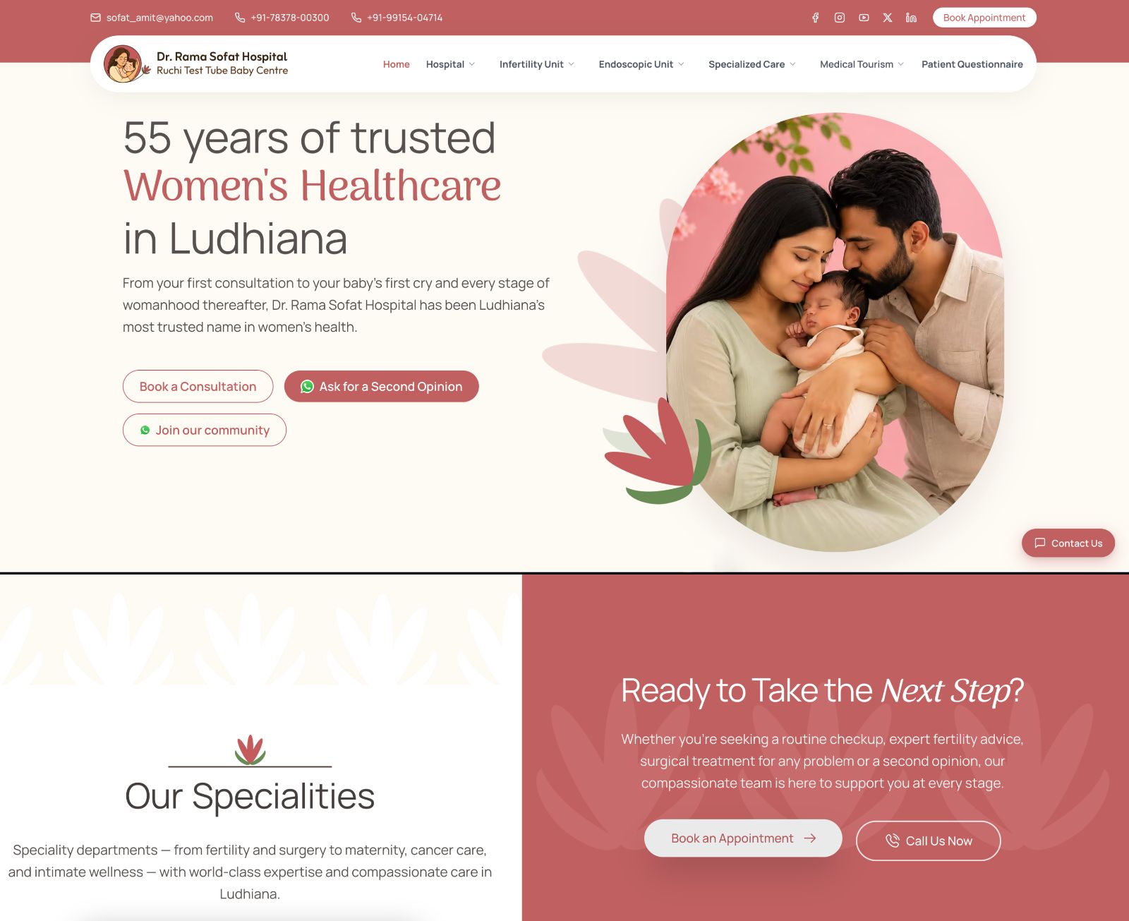
Beyond the logo, a consistent design element set was built - palette, motifs, visual language, for reliable, cohesive use across Instagram, websites, print, signage, and everything in between.
Below is a glimpse of the logo elements being used on their website:
Summary
A cohesive brand identity now gives the hospital a recognisable presence. By preserving its emotional core while modernising the execution, the brand is now better equipped to communicate with clarity, confidence and warmth.