One Identity, Multi-verticals: A Unified Brand System for Arogya Group
Giving multiple healthcare-legal verticals one shared identity - without letting any of them lose their own voice.

- Logo Design
- Brand Collaterals
- Corporate Presentation Template
- Logo Reveal Animation
Arogya Group spans Legal, Compliance and Logistics in healthcare, but previously lacked a shared visual identity across the three verticals.
Spindigo Designs LLP created a unified brand system built around one geometric mark, adapted with distinct colours and symbols for each vertical.
This gives every division its own relevance while clearly connecting it back to the larger group.
The identity now works consistently across print, presentations, digital touchpoints and the office environment.
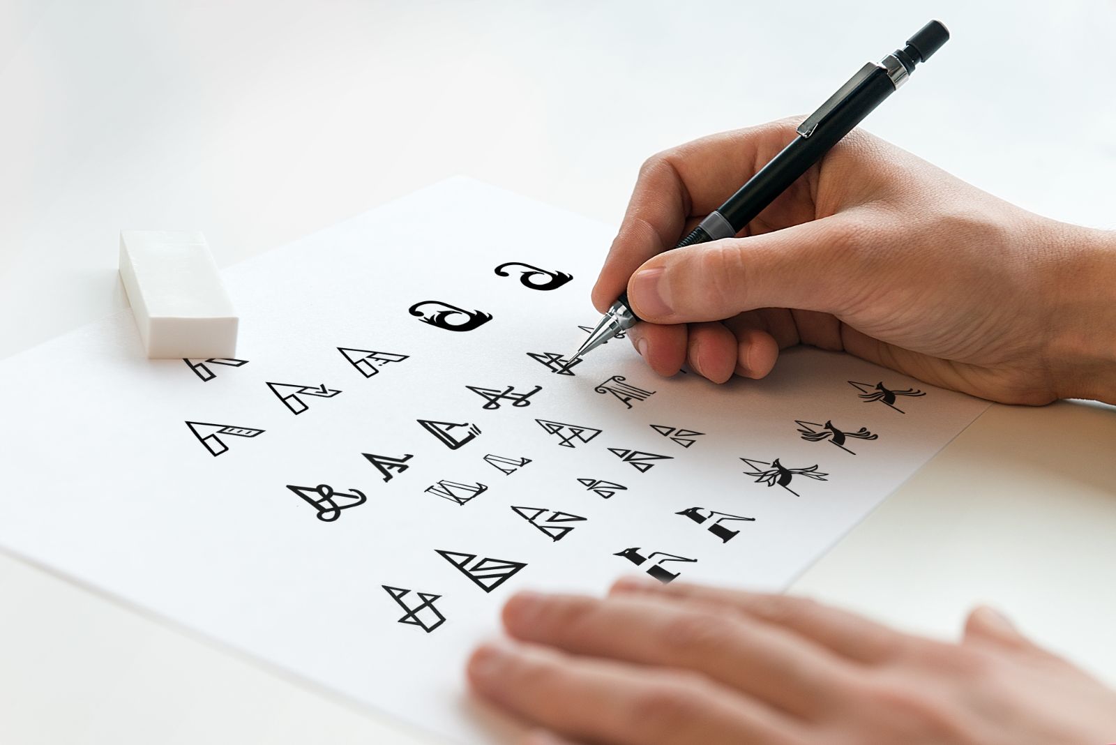
Initial Ideas
The initial concepts focused on creating a strong, unified foundation for Arogya Group - one core mark that could represent the brand as a whole.
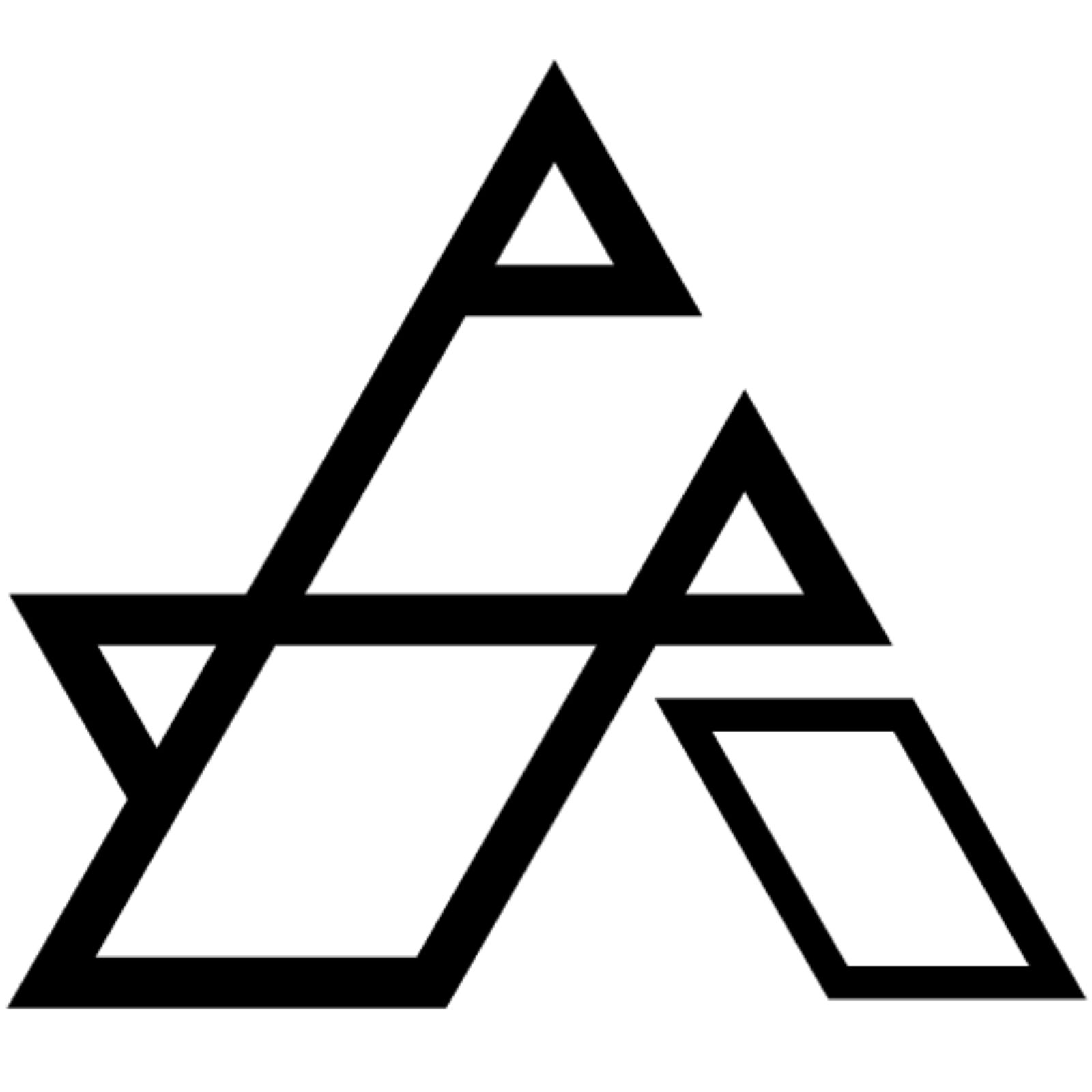
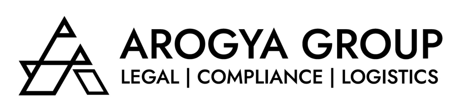
The Primary Logo For The Arogya Group
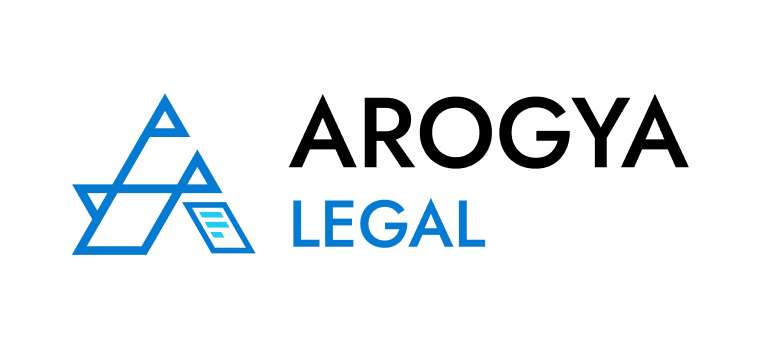
The Arogya Group mark is built around a bold, triangular “A”, creating a strong visual anchor for a group operating across healthcare-focused Legal, Compliance and Logistics.
Its angular, triangular construction gives the identity a sense of stability, precision and authority, while the three smaller triangular forms integrated within the symbol represent the group’s three verticals - Legal, Compliance and Logistics.
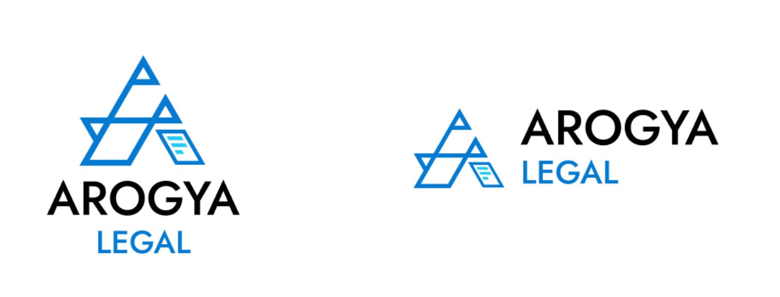
Logo for Arogya Legal & Arogya Compliance
For differentiation, each vertical carries a unique color and symbolic accent on the right leg of the 'A':
Legal - Blue with a document motif, representing law, structure, and accountability.
Compliance - Green with a check mark, symbolizing accuracy, adherence, and trustworthiness.
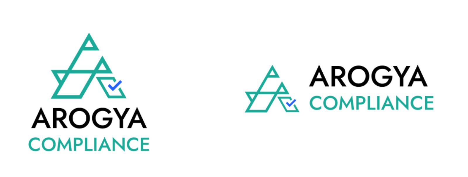
Together, these variations ensure consistency within the group identity while giving each vertical its own distinct recognition.
Logo Reveal Animation
A restrained, high-impact motion reveal built for Arogya Legal, designed to open corporate decks and client pitches, and reusable across the website, social media, and digital campaigns.
Business Cards & Letterheads
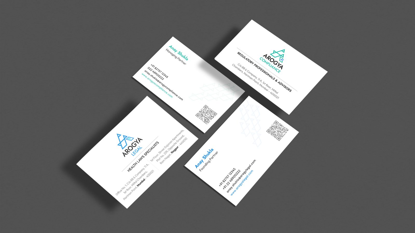
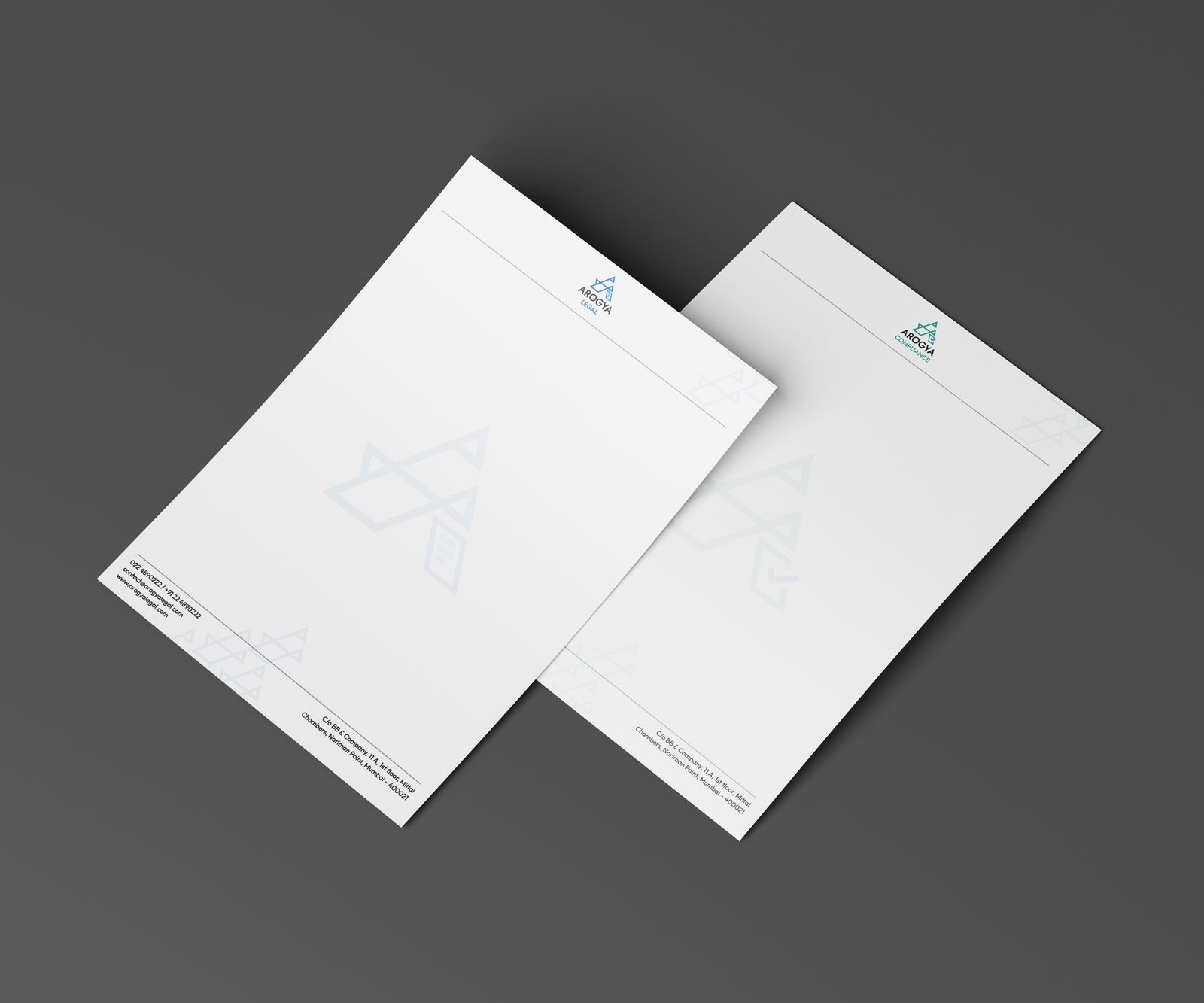
Stationery built on the same type and palette, with the abstract 'A' pattern arranged along the card edge and letterhead margins. Distinctive without competing with the content it carries.
Corporate Presentation Template & Capability Statement
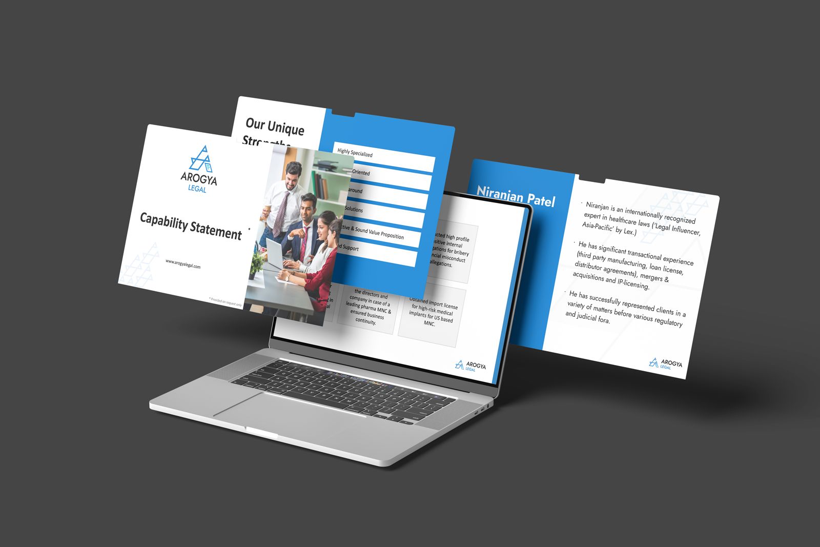
A brand-aligned deck template plus a strategically structured Capability Statement for Arogya Legal, turning a sales conversation into a consistent, credible document the team can reuse.
Brand in Space
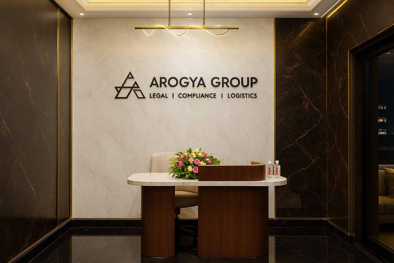
The identity moved off-screen and onto the office wall. A physical anchor for the brand that sets the first impression for every client who walks in and reinforces it for the team everyday.
Summary
A unified, structured identity now brings Arogya’s Legal, Compliance and Logistics verticals under one cohesive brand system. The identity was successfully designed to adapt seamlessly across print, digital and environmental applications.