A Symbol of Infinite Care - Brand Identity for AshKa Learning Hub , an Inclusive Learning Space
A warm, expressive identity created for AshKa, a learning hub for children with special needs, built around the ideas of care, growth, stability and infinite potential.
- Logo Design
- Brand Collaterals
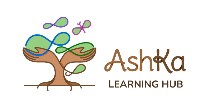
Our goal was to create a visual identity that resonates with the essence of AshKa - a place of blessing, care, and nurturing for neurodivergent children. The logo needed to reflect safety, warmth, inclusivity, growth and the infinite possibilities of learning, while staying child-friendly and approachable.
The Idea Behind The Logo
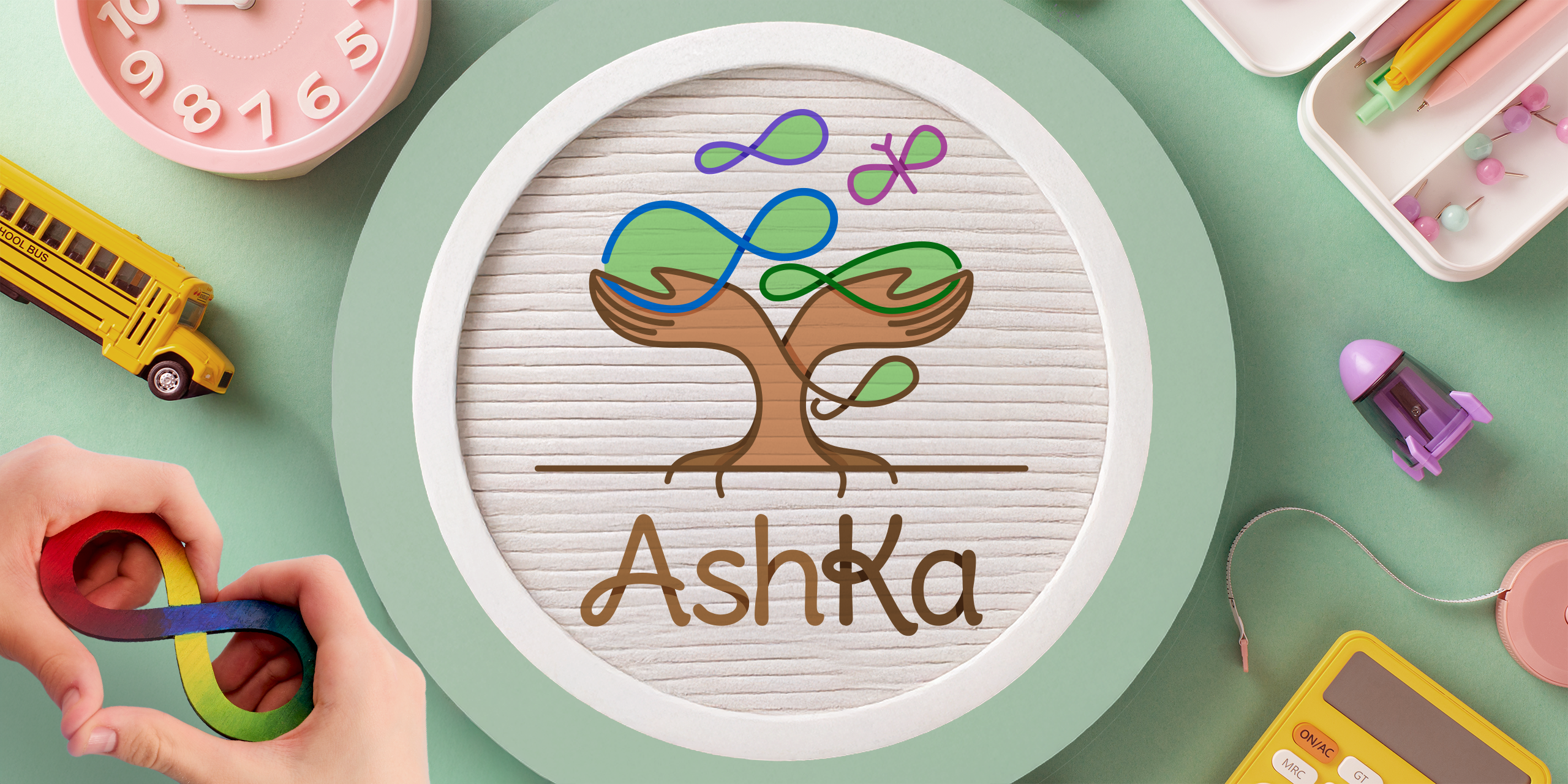
The AshKa logo is designed as a visual story of nurture, learning and transformation.
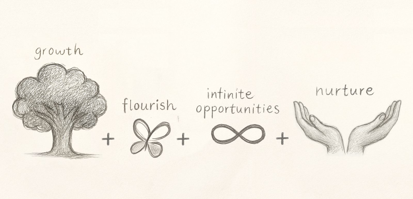
At its centre is a strong, grounded tree trunk, symbolising the stable structure and foundation AshKa provides for every child’s learning and development.
The tree grows into a pair of open, caring hands, representing the safe, supportive and nurturing environment created for children to grow at their own pace and with confidence.
Flowing through the tree are multiple infinity symbols - a reference to autism and neurodiversity, but also to the idea of infinite possibilities, potential and different ways of learning.
Above the tree, the infinity form transforms into a butterfly, symbolising growth, freedom and transformation. It represents the ultimate hope behind the brand - that with the right care and support, every child can flourish and eventually spread their wings and fly.
The bright, varied colour palette adds optimism and appeals to children and parents alike. The soft, loopy typography mirrors the infinity curves in the logomark.
Together, the elements turn the logo into more than a symbol; they communicate AshKa’s entire philosophy of providing strong roots, patient nurturing and the freedom to grow.
The Final Output - Built to Scale
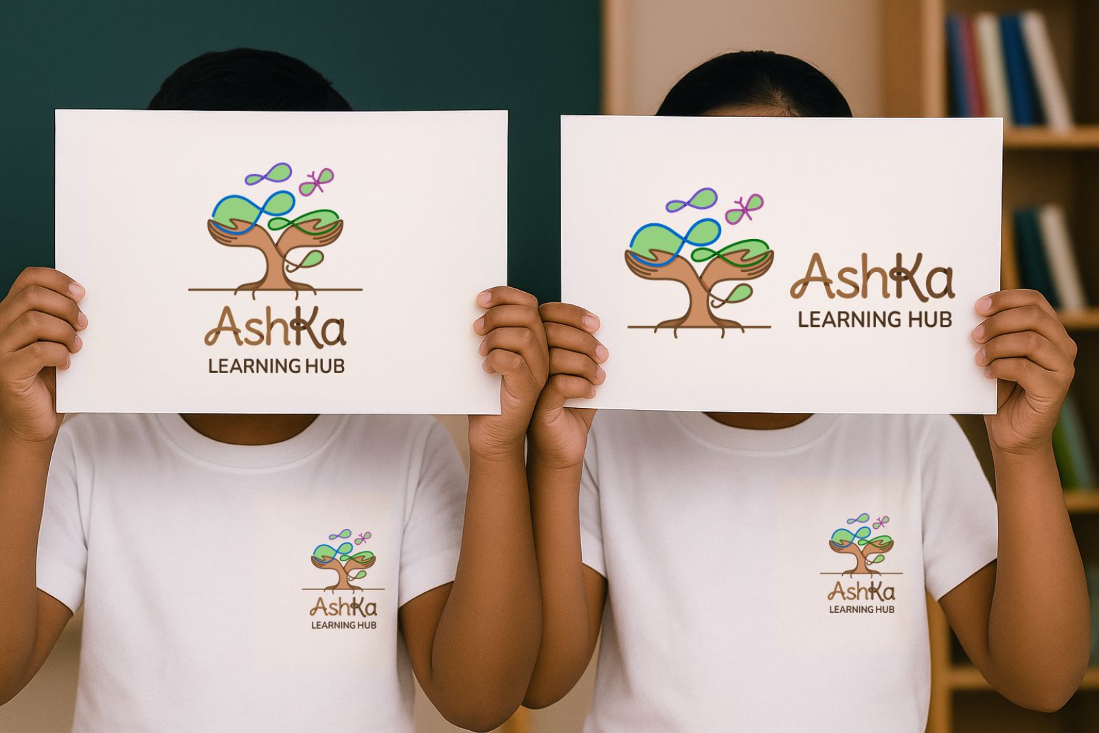
The final logo was developed in a clean, vector format, ensuring scalability and uncompromised quality across all applications, whether for digital platforms like websites, print materials, or large-scale signage.
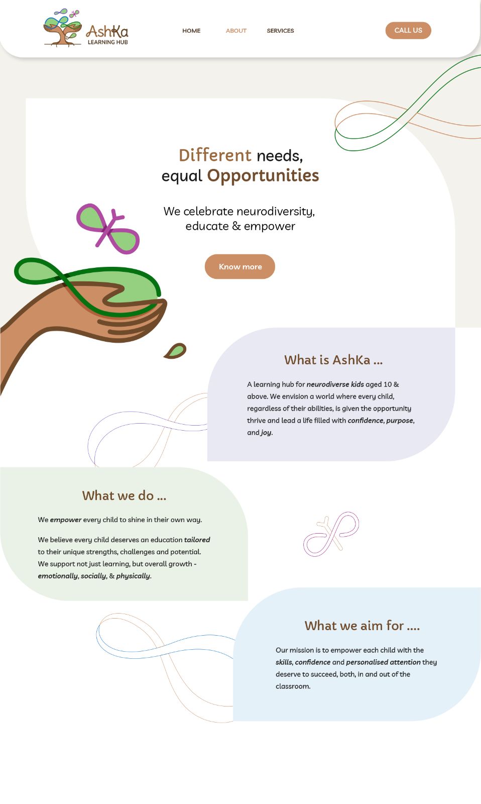
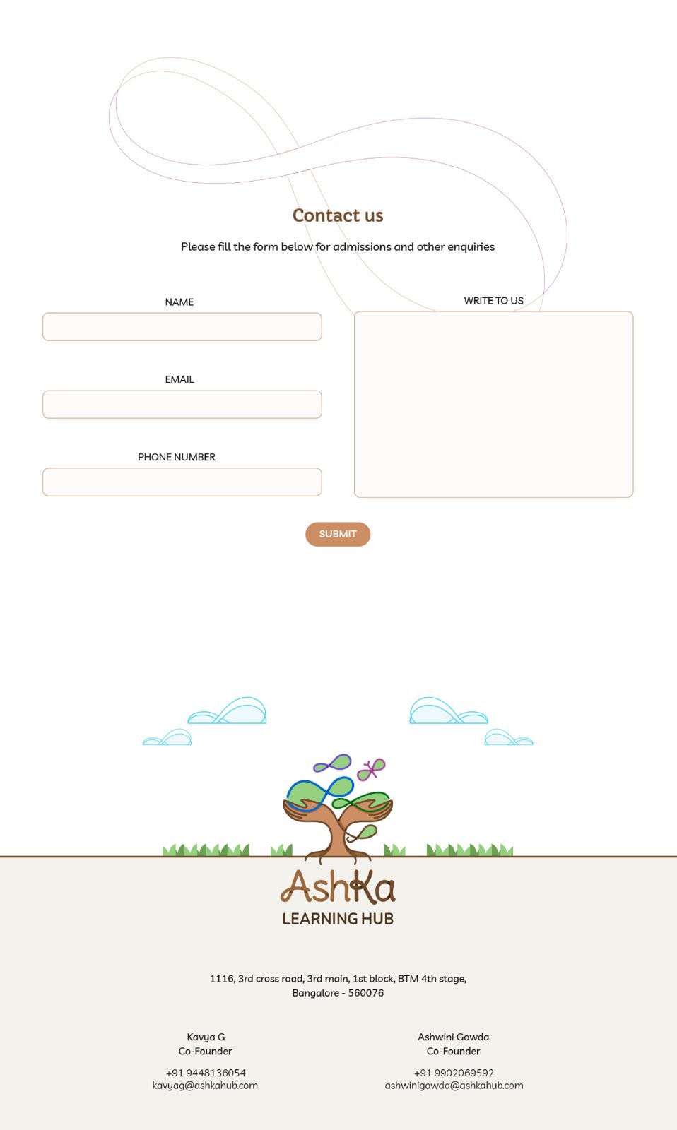
Below is a glimpse of the logo elements being used on their website:
Brand Collaterals - Stationery Design
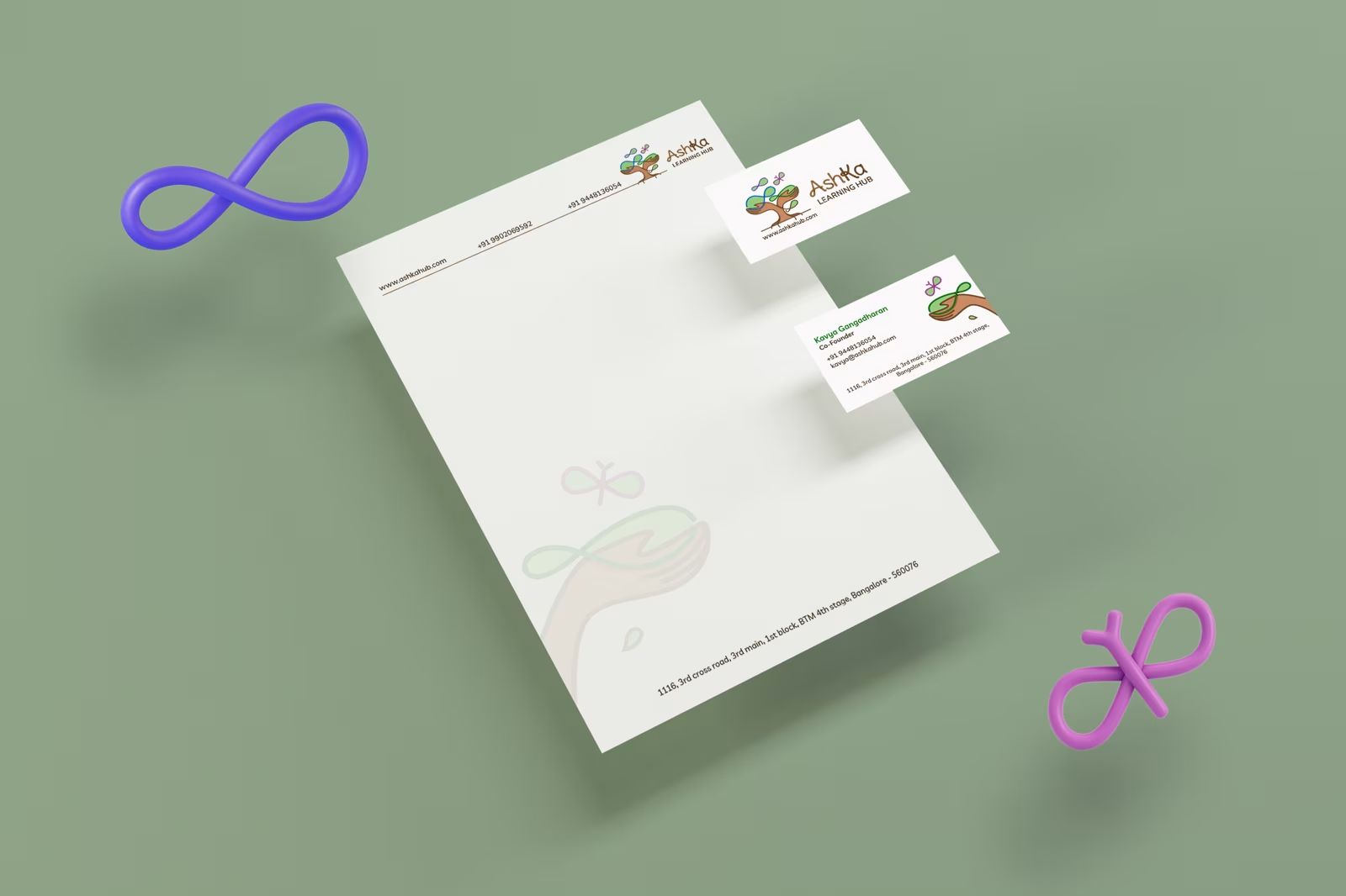
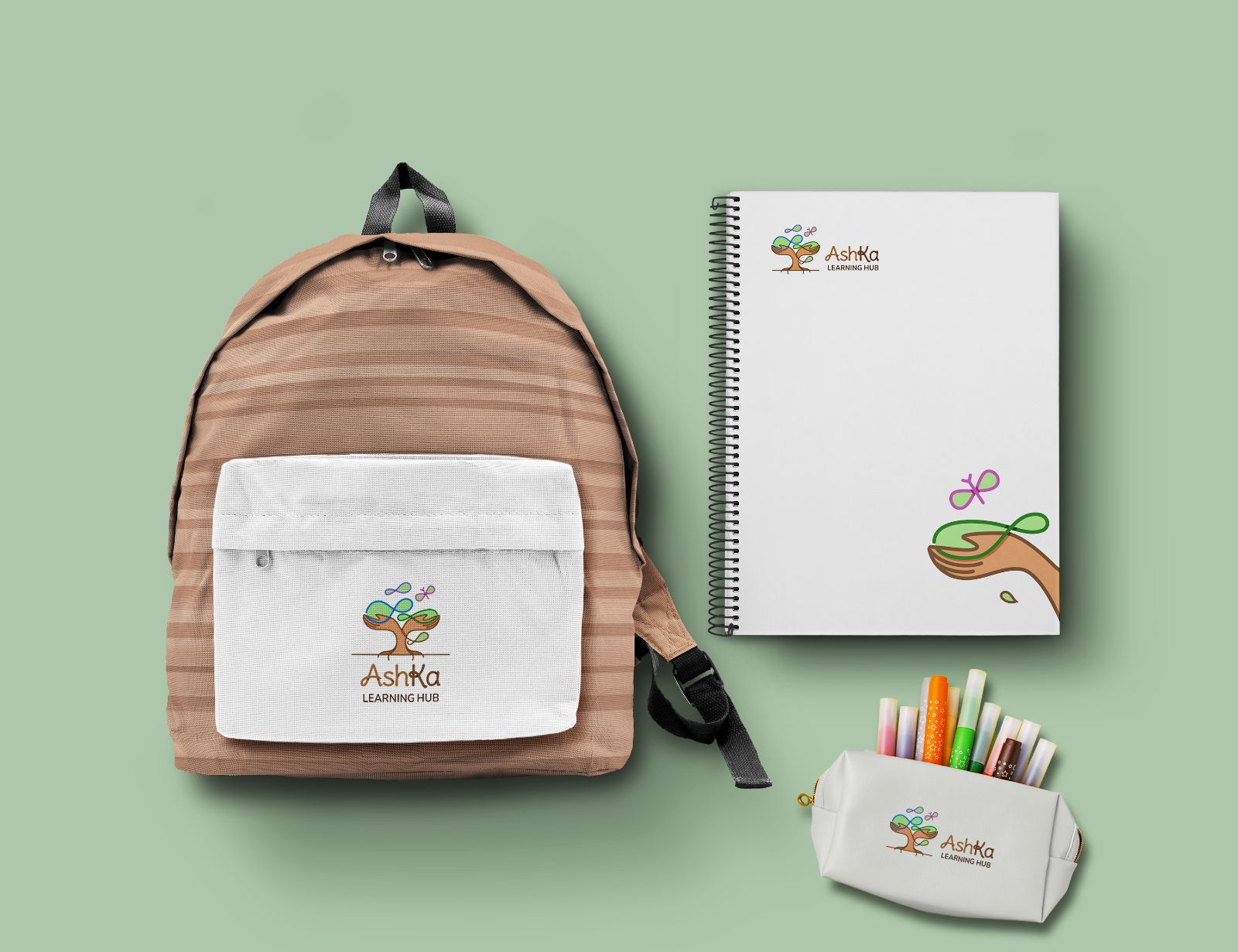
The AshKa identity was extended into a warm, playful, yet professional stationery system, carrying the same visual language beyond the logo. The infinity and butterfly motifs, along with the nurturing hand illustration, are used as subtle supporting graphics across the letterhead and business cards.
Summary
The AshKa Learning Hub identity turned out to be warm, meaningful and highly expressive, with every part of the logo connected to the organisation’s purpose.