
From No Identity to a Strong CA Brand - RDR & Associates
A complete identity was created for a chartered accountancy firm that feels professional, contemporary and consistent across both, print and digital applications.
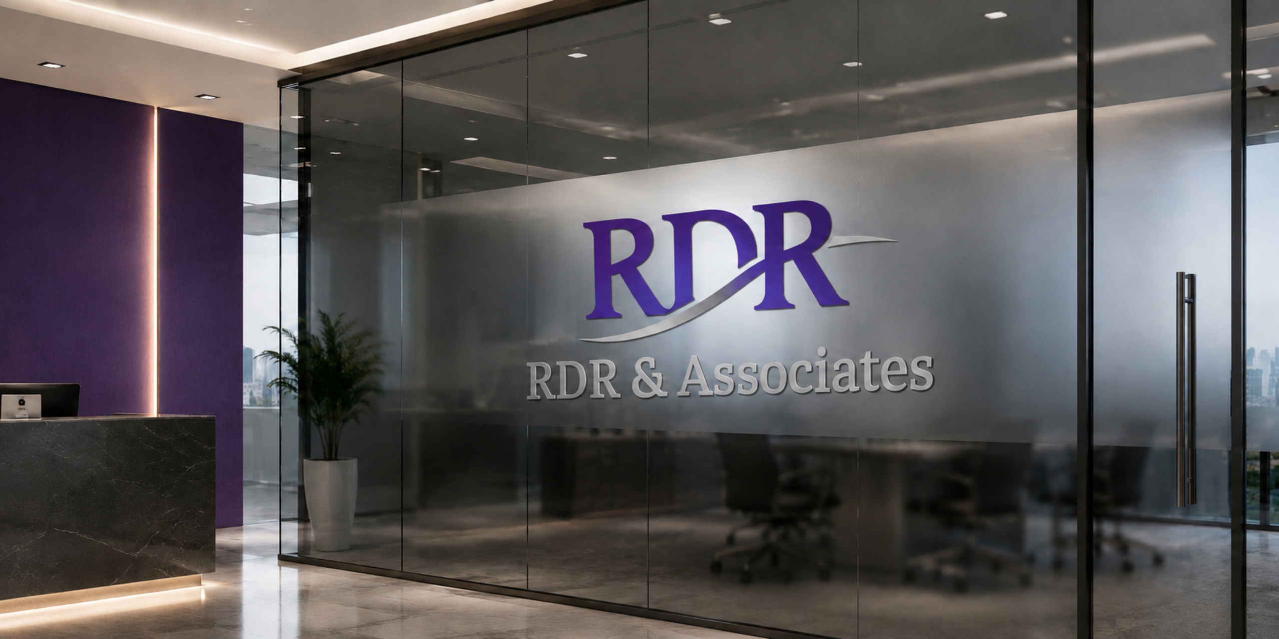
- Logo Design
- Brand Collaterals

RDR & Associates had no defined visual identity, resulting in an inconsistent presence across print and digital touchpoints.
We built the brand from the ground up with a new logo, colour system, typography and clear brand guidelines.
The identity was anchored in the firm’s initials and kept deliberately restrained to reflect the precision and credibility expected of a chartered accountancy practice.
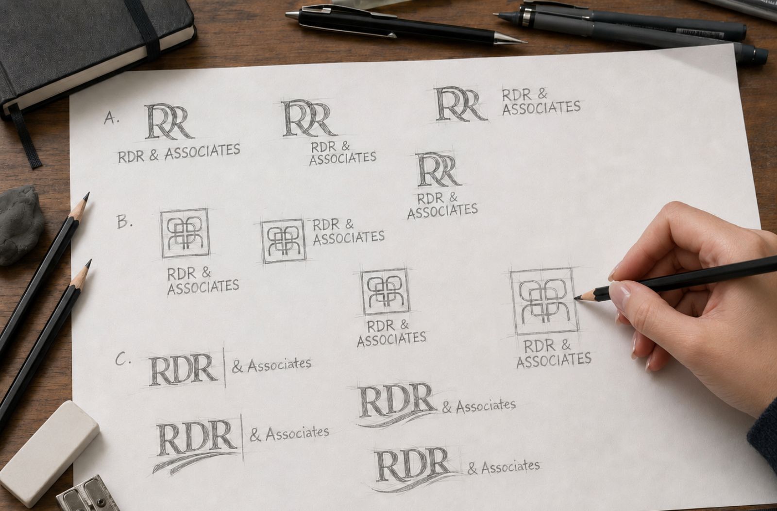
Initial Ideas
The initial design process explored multiple ways of turning the RDR initials into a distinctive and credible identity. Concepts ranged from interlocking monograms and structured geometric marks to more typographic approaches that emphasised the letterforms themselves.
The Final Output
The core mark was built on RDR's typographic initials. Simple, professional, and durable - designed to age well. How to still make it look original was the challenge.
The sweeping curve running through the letters adds movement and refinement, while also helping unify the three initials into a single visual form.
The deep purple gives the identity a confident, premium presence, while the restrained grey adds balance, maturity and credibility.
The typography combines a classic serif style with a clean, structured composition, giving the brand a sense of permanence and authority while still feeling contemporary.


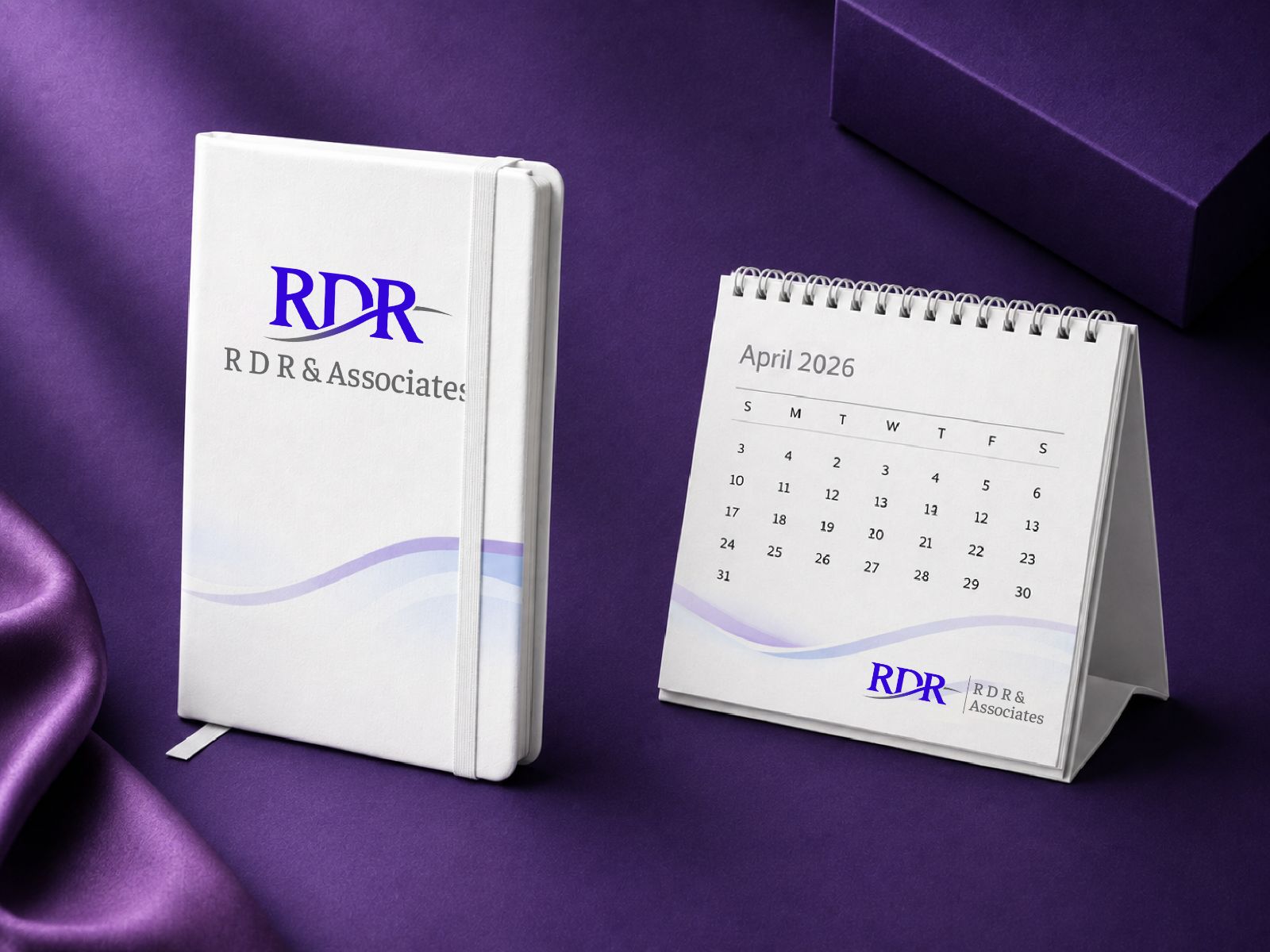
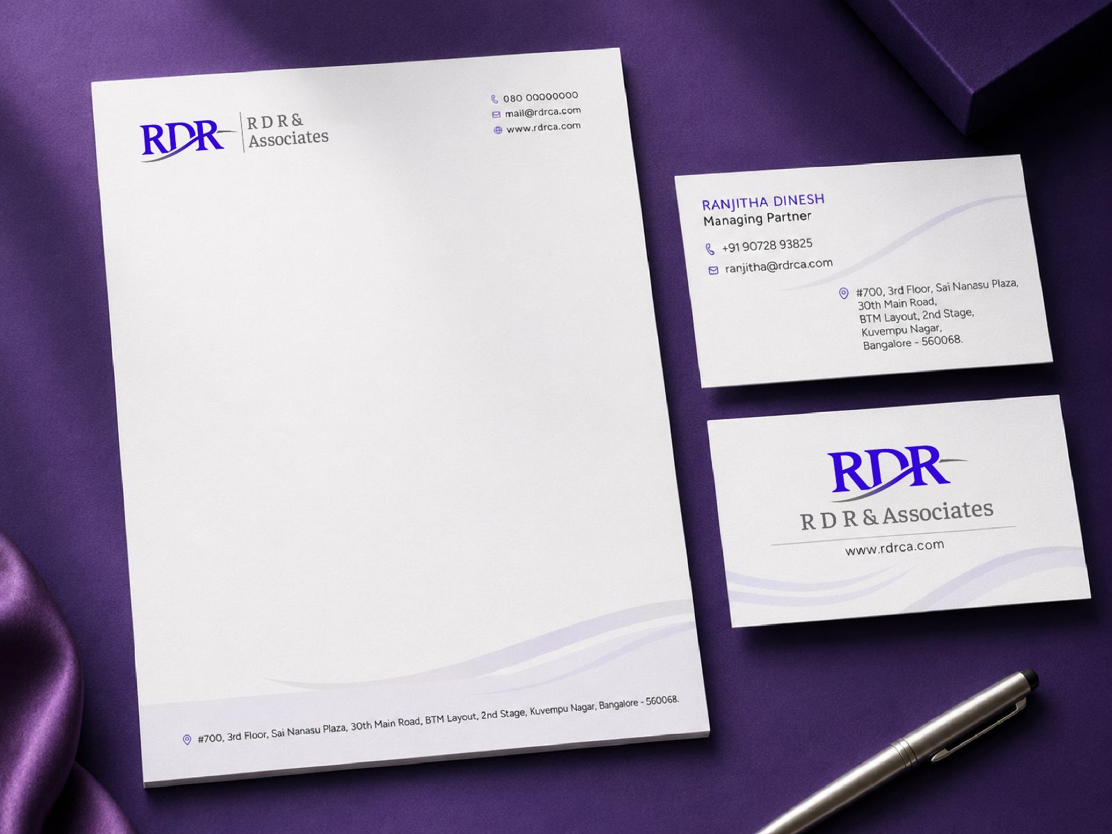
A Consistent Brand, Down to the Details
The RDR & Associates identity was extended across business cards, letterheads, diaries, calendars and other stationery.
The design carries forward the brand’s deep purple and grey palette and the signature sweeping curve from the logo as a subtle recurring graphic element. Generous white space keeps the stationery refined and functional, while the restrained use of colour adds sophistication.
The result is a stationery system that feels cohesive, premium and unmistakably RDR.
Summary
The final identity turned out to be sophisticated and understated, reflecting the trust and reliability expected from a financial advisory firm.