A Unified Brand Design,
Arogya Group
A seamless logo, identity system and brand strategy for Arogya Group: Confidence, cohesion and distinction across legal, compliance, and logistics in healthcare.
What we did
The Project
Our goal was to design a visual identity that establishes Arogya Group as a strong, trusted partner in the healthcare legal space. The system needed to convey stability and confidence while distinguishing the three service verticals - Compliance, Legal, and Logistics, under a cohesive brand language.
Beyond just visuals, our approach focused on creating a brand strategy that positions Arogya Group as both authoritative and approachable. The identity was designed to build long-term recognition, ensure adaptability across touchpoints, and provide each vertical with its own voice while staying rooted in a cohesive group narrative.
Idea Behind The Design
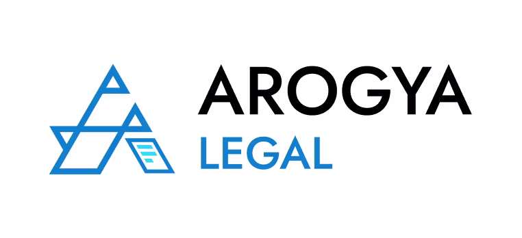
The central logo is built around an abstract ‘A’ - a direct reference to Arogya, meaning “health” or “absence of disease” in Sanskrit. This geometric ‘A’ is constructed on a triangular foundation, symbolizing stability, strength, and confidence - core attributes for a law firm.
Inside the main form, three smaller triangles represent the firm’s three service verticals: Arogya Compliance, Arogya Legal, and Arogya Logistics. This layered triangular structure signifies growth from a strong base, precision, and clarity of thought.

The sharp, pointed silhouette echoes the seriousness and authority of the legal sector, while the chosen typeface complements the angularity of the mark, reinforcing a sense of professionalism and decisiveness.
The Primary 'Arogya Group' Logo
The primary logo is rendered in bold black, symbolizing strength, authority, and neutrality. Unlike the vertical-specific logos, the right leg of the ‘A’ is intentionally left unembellished. This signifies that the group identity stands above individual divisions—representing the collective foundation, vision, and integrity of the entire firm.
Logo for Different Verticals
For differentiation, each vertical carries a unique color and symbolic accent on the right leg of the 'A':
Legal
Blue with a document motif, representing law, structure, and accountability.
Compliance
Green with a check mark, symbolizing accuracy, adherence, and trustworthiness.
Together, these variations ensure consistency within the group identity while giving each vertical its own distinct recognition.
Logo Reveal Animation
We created a classy and impactful logo reveal animation for Arogya Legal, designed to elevate their presentations and adaptable across multiple brand touchpoints like corporate decks, website, social media, client pitches, and digital campaigns.
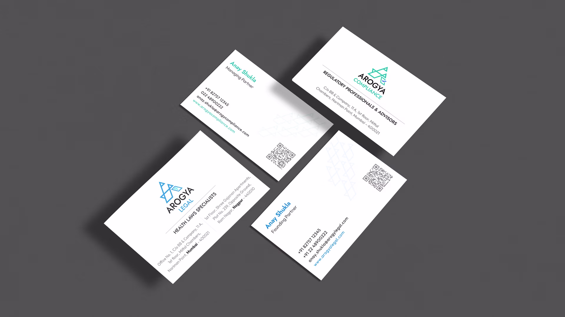
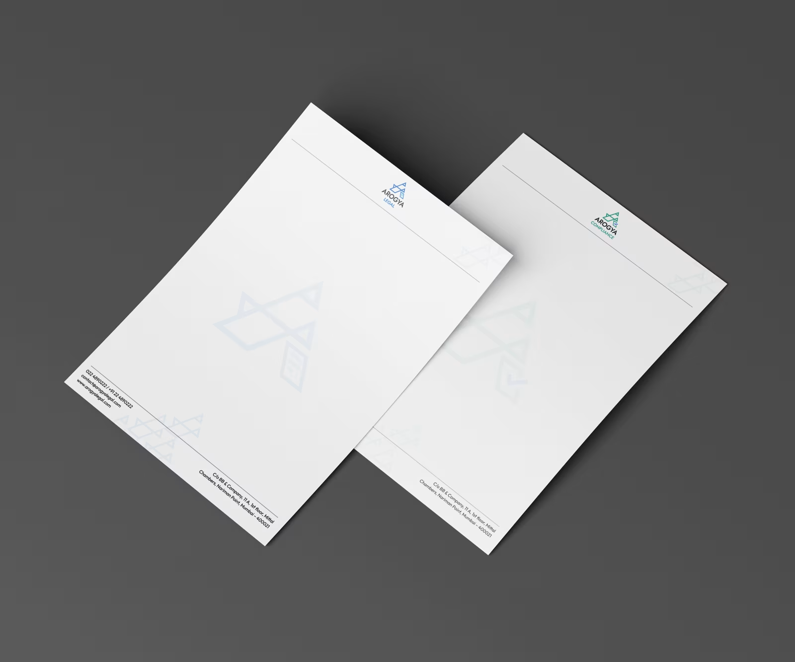
Brand Collaterals
For all the stationery design, each vertical - Arogya Compliance and Arogya Legal, is distinguished by its respective color and logo, while the layout ensures clarity, readability, and ease of use for official communication.
Business Cards
We designed business cards using the same fonts and color palette to maintain brand consistency. The design features the abstract ‘A’ pattern (without the right bottom leg) arranged creatively on the right side, adding a subtle yet distinctive visual element.
Letterheads
The letterhead designs were created to align seamlessly with the overall identity system, using the same fonts and colors. The abstract ‘A’ pattern (without the right bottom leg) same as the one in business card designs is applied subtly along the margins, adding visual interest without overpowering the content.
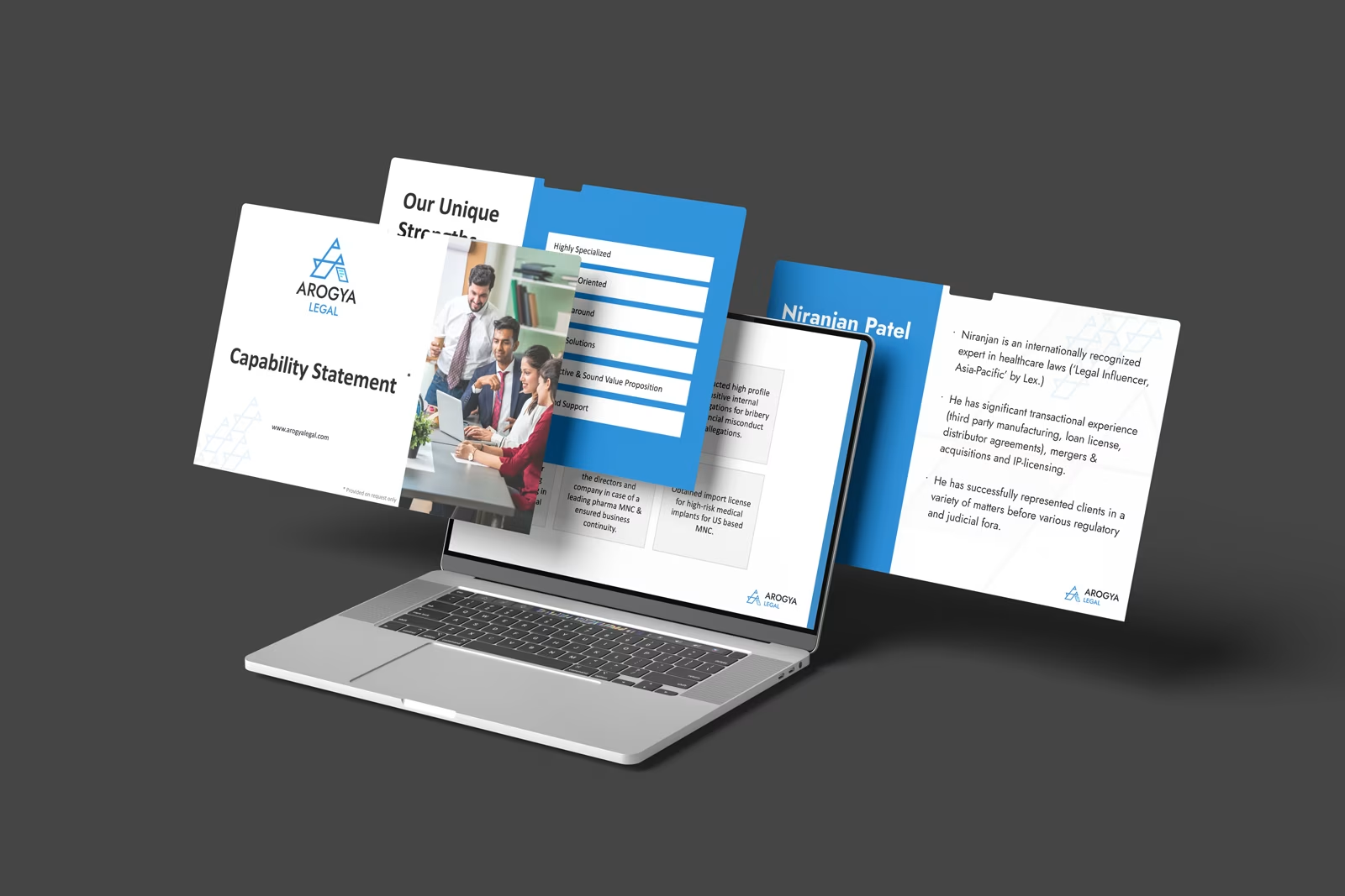
Corporate Presentation Template
We designed a modern, brand-aligned corporate presentation template and strategically crafted Arogya Legal’s Capability Statement to effectively communicate their expertise and value.
Brand in Space
The new identity extended beyond stationery into the physical environment, with the Arogya Group logo featured prominently on their office wall design. This spatial application reinforced brand presence, creating a strong first impression for clients and employees alike while seamlessly integrating the visual identity into their workplace.


Summary
The final identity system successfully balances unity and distinction - delivering a bold, memorable group identity while equipping each vertical with its own symbolic strength.