A Symbol of Infinite Care and Acceptance,
AshKa Learning Hub
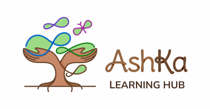
Logo, brand, and collateral design for AshKa Learning Hub, an inclusive school for neurodivergent children, symbolizing autism awareness, growth, and care.
What we did
The Project
Our goal was to create a visual identity that resonates with the essence of AshKa - a place of blessing, care, and nurturing for neurodivergent children. The logo needed to reflect safety, warmth, inclusivity, growth and the infinite possibilities of learning, while staying child-friendly and approachable.
Idea Behind The Design
The AshKa logo brings together symbolism, emotion, and purpose in a cohesive form.
At its heart, the logo depicts two protective hands forming the trunk of a tree, embodying safety, strength, stability, guidance, and nurturing care.
This tree grows into infinity symbols that represent lush green foliage - conveying growth, acceptance, and boundless potential.
The infinity motif carries a dual meaning: it is universally recognized as a symbol of autism awareness and also stands for infinite acceptance and possibilities, reinforcing the school’s philosophy.
The typography complements this vision with a soft, loopy style that echoes the infinity shapes above, making the design approachable, friendly, and child-centric.
The Final Output
The final logo was developed in a clean, vector format, ensuring scalability and uncompromised quality across all applications, whether for digital platforms, print materials, or large-scale signage.
Brand Collaterals
Stationery Design
To complement the Ashka Learning Hub brand identity, we designed professional letterheads and business cards that maintain a cohesive visual language with the logo.
Summary
The AshKa Learning Hub logo beautifully encapsulates the school’s vision. It succeeds in being warm, protective, and symbolic while remaining playful and approachable for children and parents alike. The design reflects not only a brand identity but also the heartfelt mission of the founders, to create a safe and blessed space of learning for every child.