Skip to content
Support
Online
Hi there 👋
How can we help you?
We are offline at the moment. We usually respond between 9AM to 6PM IST on all days except Sundays.
Please leave a message and we shall get back to you at the earliest.
Logo & Brand Design
Education

A Brand of Perseverance and Possibility,
Pipilika

Discover how we designed the Pipilika logo - a culturally rooted, inclusive identity crafted for a product line by neurodivergent creators. Symbolizing determination, growth, and resilience, this case study highlights our design process, concept, and final outcomes.

What we did

Logo Design
Brand Design
Print Design
Overview

The Project

Pipilika, meaning ant in Sanskrit, is a product line created by neurodivergent children at Anantha Academy. Our task was to design a brand identity that is simple, memorable, and deeply rooted in Indian culture, while also being approachable and inclusive for children, families, and educators.

The logo needed to embody values of perseverance, determination, and growth - qualities mirrored both in ants and in the journeys of these children, who with the right support, can achieve extraordinary milestones.

Industry
Education
Project Type
Logo & Brand Design
The Concept

Idea Behind The Design

The Pipilika logo combines cultural symbolism, accessibility, and inclusivity into one cohesive identity.

  • Core Symbolism: At the heart of the design is a bold red circle — representing strength, determination, and the resilience of ants.
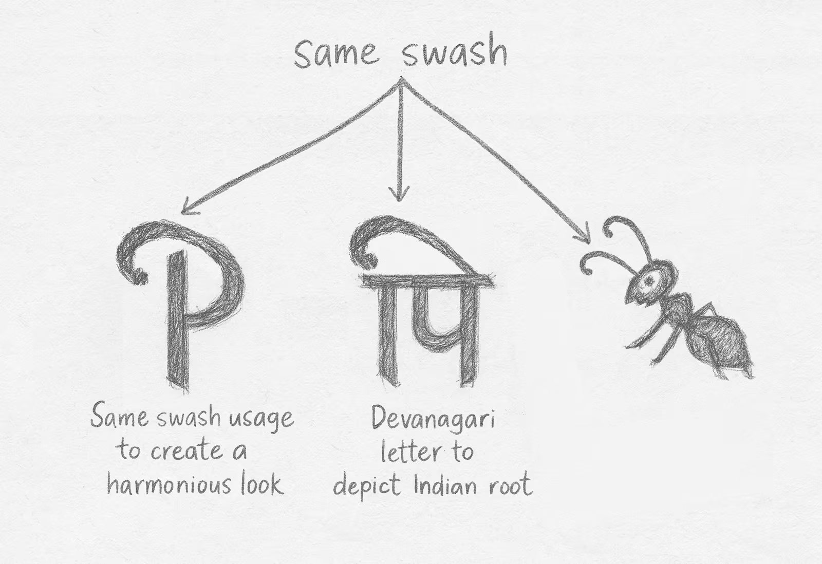
  • Cultural Connection: The Devanagari character ‘पि’, derived from Pipilika, anchors the design in tradition while doubling as a perch for the brand’s ambassador - a red ant.
  • The Ant: Depicted as professional yet approachable, the ant balances warmth with seriousness, embodying the brand’s values.
  • Script Harmony: A key strength of the logo lies in the visual connection between the Devanagari ‘पि’ and the English ‘P’. Both share a similar top stroke, emphasized in the design to create flow and continuity. This not only bridges scripts aesthetically but also reflects the brand’s dual identity — rooted in Indian tradition, yet accessible to a global audience.
  • Typography: The English typeface was chosen for clarity, legibility, and neurodivergent-friendliness, ensuring inclusivity in communication.

The tagline — “Small feat, Big dreams” — reinforces Pipilika’s philosophy: every small step can build into something extraordinary, much like ants building anthills.
The Final Output

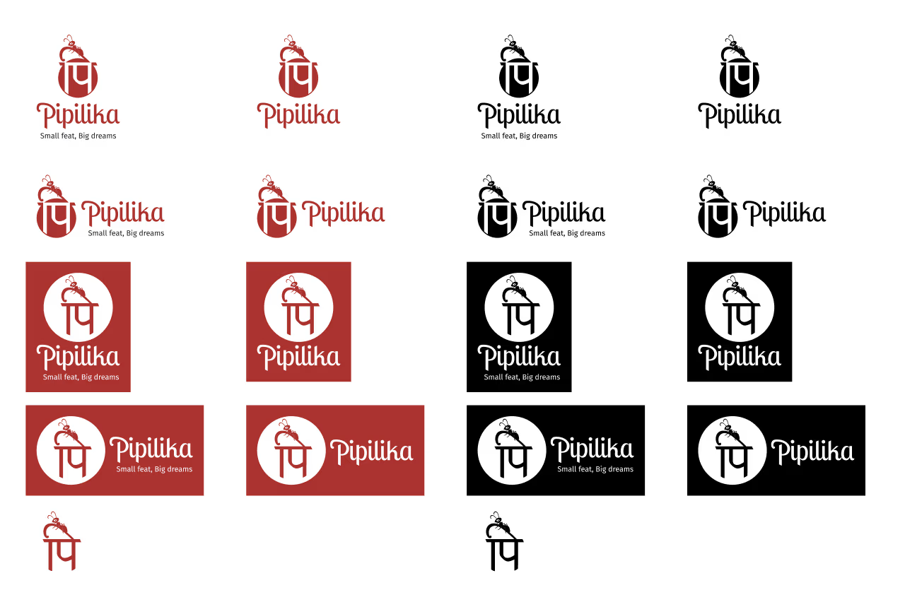
The logo was designed in vector format, guaranteeing sharpness and scalability across all mediums — from small merchandise to large-scale displays.

To ensure versatility, we delivered a full set of variations:

  • Layout Options: Vertical and horizontal orientations for flexible placement.
  • Color Versions:
    • Red on White (primary)
    • Black on White (monochrome)
    • White on Red (reversed)
    • White on Black (alternate reversed)

Brand Collaterals

Stationery Design

The business card design carries forward the bold red circle and logo mark, creating a professional yet approachable identity touchpoint.

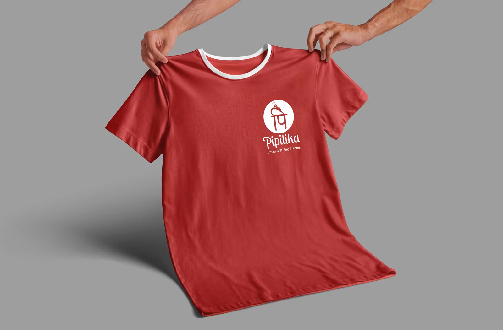
Merchandize Design

Branded t-shirts feature the ant mascot and tagline, turning wearers into walking ambassadors of determination and growth.

Package Design

Snack packets and bottles showcase the adaptable logo variations, ensuring strong visibility and consistency across everyday products.

Conclusion

Summary

The Pipilika logo is instantly recognizable and meaningful. It strikes a balance between aesthetics, cultural authenticity, and universal readability, giving Pipilika a strong identity that children, educators, families, and customers can proudly connect with.