Powering Events with a Striking Logo - EventForce
A bold and modern logo for EventForce that integrates typography and motion to embody innovation, energy, and seamless event management.
- Logo Design
Creating a bold and dynamic logo that captures EventForce’s innovation and expertise in event management.
Idea Behind the Logo
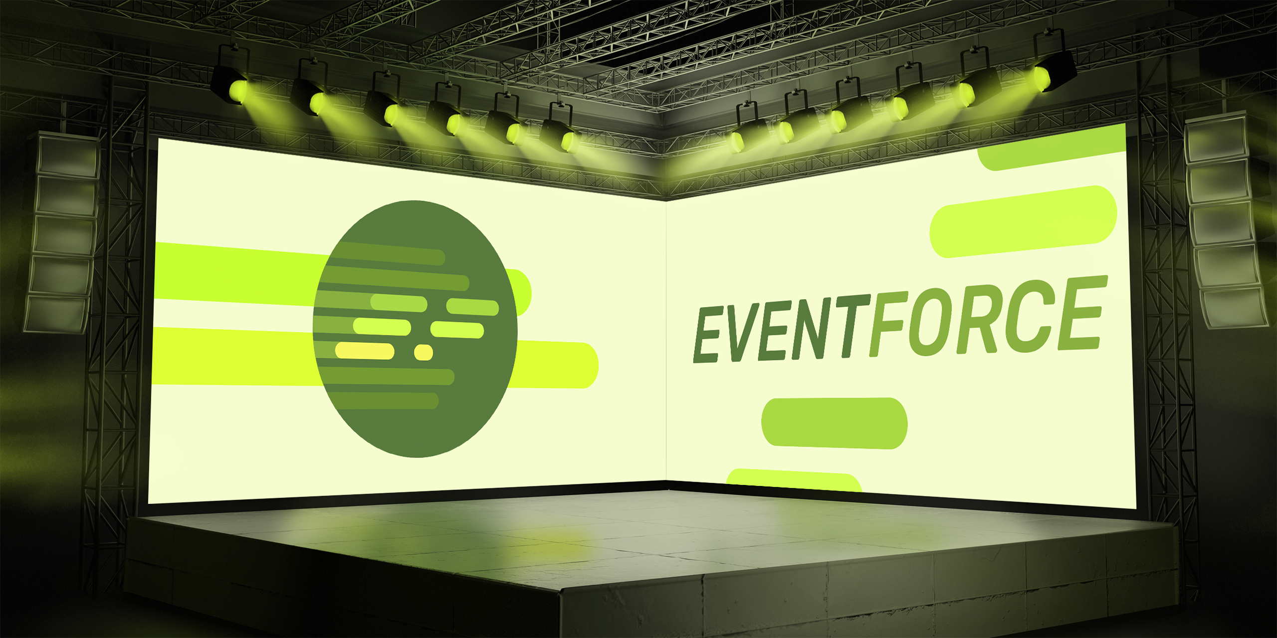
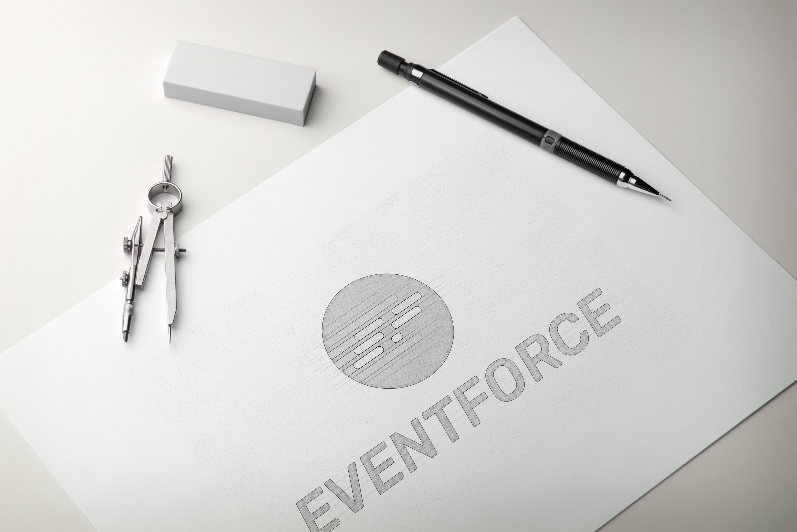
The EventForce logo is a typography-based design enclosed within a circular form. The logo creatively integrates the letters ‘E’ and ‘F’, which represent EventForce, using sleek, dynamic lines that evoke a sense of motion and energy.
These lines are designed to appear as if they are slicing through the space, creating a feeling of momentum and force - perfectly aligning with the brand’s name and vision. The transition between the lines and the letters ‘E’ and ‘F’ is seamless, reinforcing the idea of fluidity and efficiency in event management.
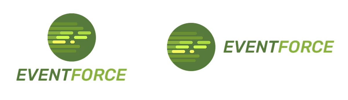
To ensure clarity and brand distinction, the ‘E’ and ‘F’ stand out through a strategic color difference, making them immediately recognizable while still feeling like an integral part of the surrounding movement. The use of dynamic line work adds a sense of speed, energy, and innovation.
Final Output
The final deliverables included both colored and black-and-white versions of the logo, provided in vector format to ensure versatility and scalability across various applications.
Brand Collaterals
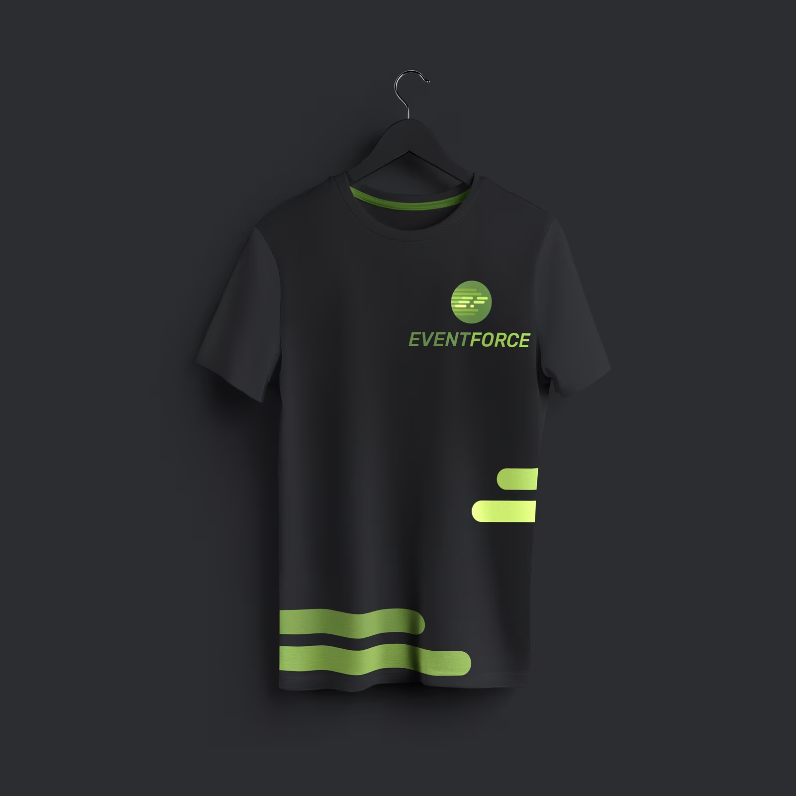
T-Shirt Design
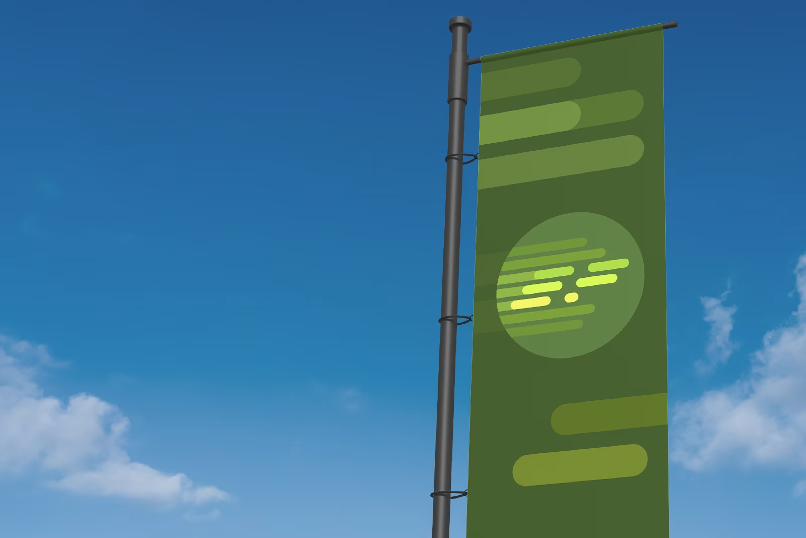
Event Banner
Summary
The final logo has been well-received for its memorable, versatile, and impactful design, making it a strong visual representation of the company.